The first thing that catches your eye when you unfold a sheet of paper with a print or open a fresh vector layout is color. Not lines, not fonts, not the technical perfection of vector geometry, but color. It speaks to us even before we start analyzing the visual composition. In vector art, color is not just a decoration. It is a speech encoded in every layer and gradient.
Sometimes the color selection process is intuitive, while others are driven by brand palettes, but most often it has psychology, emotion, and meaning behind it. As a designer or craftsman, you can make conscious choices about colors that capture a mood or set the direction of the project.
In this article, we’re taking a deeper dive into how color “speaks” in vector graphics and why these nuances are worth considering, especially in printed or decorative works.
Even those who create digital templates or choose colors for stickers or posters turn to alternative inspiration sources, such as a psychic reader to catch the intuitive wave that will lead to the perfect combination.
Color as an Emotional Code in Digital Art
Vector graphics is an extremely precise and flexible tool that allows artists to work with shapes without losing quality. When it comes to emotional impact, it’s color that expresses meaning without words, creates atmosphere and sets the tone.
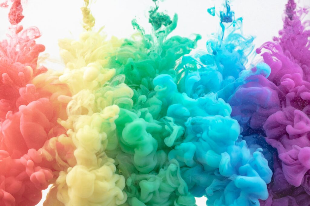
For instance, red creates excitement, power, and warning. In logos, it can encourage action. In vector illustrations, it can create dramatic effects.
Blue is usually linked to calmness, trust, and order. It is often used in vector images for government or educational projects.
The green color is known for freshness, renewal, and vitality. It is ideal for label design or packaging of handmade goods.
Yellow brings joy and optimism, but at the same time requires delicacy – it can be tiring in excess.
These colors can be the basis of your compositions, but their combination is no less important.
Harmony or Contrast: What Works Better?
Complementary combinations are colors that are opposite each other in the color wheel (for instance, blue and orange). They cause visual tension and work well for accents.
Analog combinations are colors that stand next to each other (for example, blue, blue, and green). Create a harmonious, calm atmosphere.
Triadic schemes are three equally distant colors ( for example, red, yellow, blue). Ideal for dynamic and balanced compositions.
A tip for vector designers: before applying a color, imagine the emotion that your mockup is supposed to evoke. Look at it in black and white mode – if the composition is strong without color, it will only benefit from a well-thought-out color palette.
Color in Printed Materials: CMYK vs. RGB
In craft and printing projects, it is important to consider technical requirements. What you see on the screen (RGB) can be significantly different after printing (CMYK).
| Color space | Where to use | Features |
| RGB | Digital screens | Vivid, intense colors |
| CMYK | Printing on paper | Less saturated, more realistic |
Tip: Don’t forget to check the CMYK color palette before sending your layout to print. Minor changes in saturation can affect the quality of the result
People in Different Cultures Perceive Colors Differently
The same shade can have opposite meanings in different parts of the world. You should pay attention to these details when creating vector elements for a global market.
In Western culture, white is a symbol of purity and celebration, while in Asian cultures it is the color of sadness and mourning.
Red means success, joy, luck, and happiness in China, while in Europe it can mean danger or prohibition and is used to attract additional attention.
Purple in the West is a shade of royalty and wealth, and in South America it is associated with grief.
Color symbolism can both reinforce a message and cause confusion. This is especially important when you create app icons, sticker templates, and decorative elements. It often makes sense to consult an online psychic reader to gain a clear understanding of what exact color symbolizes.
Color as a Visual Navigator
In complex vector illustrations – infographics, diagrams, patterns – color also serves as a navigation tool. With the right use of contrasts and shades, the viewer gets the point across faster. Tips:
- Use shades of the same color to group objects.
- Use complementary or contrasting pairs to distinguish between them.
- To accentuate – highlight the most important element with a warm or bright color.
- Even small changes in saturation can have a significant impact on the readability of your layout.
Vector Art as a Personal Style Palette
Many illustrators develop their own color systems. Some prefer muted tones, others experiment with neon shades. But all of them consciously choose colors as part of their author’s handwriting. Color in vector art is not just about appearance. It is about character, mood, memory.
Vector art begins with lines and shapes, but opens up through color. After all, color is where logic and feeling meet. It is shaped by emotions. For vector artists, it is an important component in creating a design that cannot be avoided.