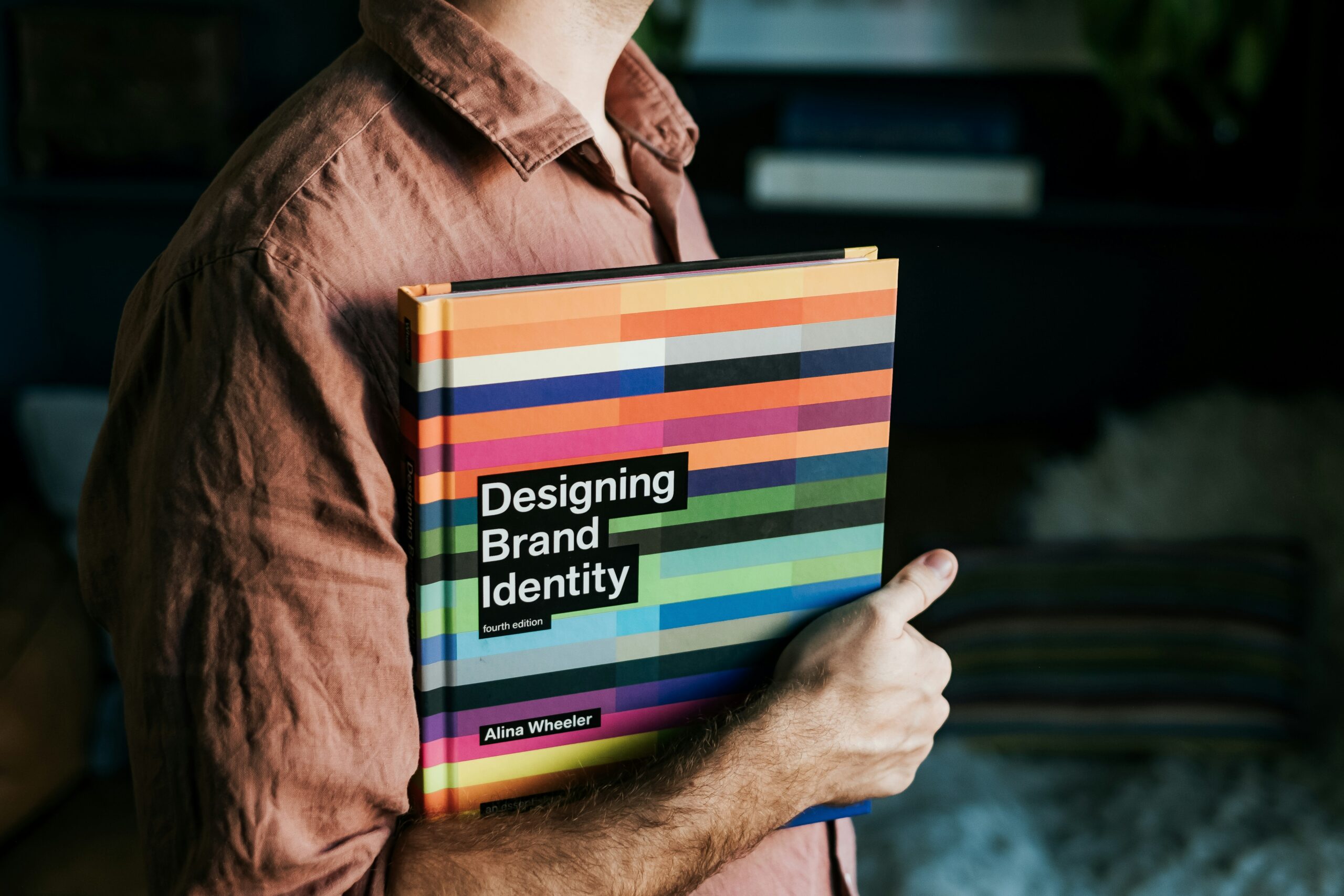
A first impression is made instantly upon viewing your advertisement, website, or business card. A disorganized brand design can affect your trustworthiness and appeal. When you know how to put together visually appealing marketing materials, your brand can skyrocket to new heights. Think of the fast food Golden Arches or the checkmark logo for popular running shoes. They’re memorable, cohesive, and visually appealing. If you want your brand materials to stand out in a crowd, you’ll need to know the best visual design elements for the most irresistible promotional materials.
Choose Colors Carefully
The colors you use for your brand matter; color psychology can help you understand how audiences respond to certain colors, themes, or moods in your marketing materials. For example, blue is considered a more trustworthy color; materials using shades of blue may appear as more “official” or authentic. Red, on the other hand, can evoke a sense of urgency or passion, depending on how it is used. Make sure your brand’s color palette has the best chance to inspire the emotions you want audiences to feel. Your colors should remain fairly consistent to establish a recognizable brand identity.
Limit Your Font Choices
Fonts can be fun to use in graphics, but you don’t want to go overboard. Too many fonts at once can look unorganized, making it difficult for viewers to focus on what you want them to. Most visual designers recommend two or three font choices at most. Those font choices should be legible, professional, and clean. You can choose one stylish accent font, but don’t overly rely on it for legibility. It can be difficult to choose a font, but prioritize ones relevant to your business’s theme without sacrificing readability.
Use Negative Space
You don’t have to fill in every square inch of an ad, business card, or logo with content. In fact, overloading your visual content can actually distract people from your overall messaging or theme. Be mindful about the size, placement, and quantity of your visual items. When you use negative (empty) space, you can draw more emphasis on the images and text. Empty space can also look professional, clean, and minimalist.
Print Physical Materials
Print media isn’t dead! Businesses can gain a lot of attention from printed marketing materials, even if they operate entirely online. Business cards can help you easily spread the word to more audiences, especially in local communities. If you have multiple services or products, you can organize and catalogue them easily for clients using elegant custom folders with pockets. Flyers and brochures can allow you to easily market locally on bulletin boards or storefronts. Printed marketing still matters, and you can use it to your advantage to attract loyal local clients.
Design Elements That Attract Attention
When you want to attract a viewer’s attention with your branding or marketing materials, you’ll need to know what elements draw the eye. If you want your audience to read text, changing the boldness, size, or font can make a significant difference. If you need them to look at images, consider vibrant colors or increasing the size of the overall image. Make sure you place elements strategically to draw the eye further. Once you grasp what entices people visually, you can create spectacular content.
Test Loading Speed
Your commercial website will contain a lot of brand imagery and promotional material. While including it is a smart choice for many, it can also affect your website’s loading speed. Website speed is a crucial factor in keeping customers on your site. If a website takes too long to display, it’s unlikely a visitor will want to wait. Make sure you test website load times when you upload new visual material. You may need to cut down on the number of images and fonts you’re displaying if the site takes too long to load.
Custom, Not Stock
Stock images that are publicly available and licensable are convenient, but they’re not unique; anyone can use them, and there are only so many ways you can style a stock image. When you incorporate custom artwork or photography, you can put a tailored and unique spin on all of your material. You won’t have to worry about other brands or competitors using the same stock images as you. Visuals that are custom for your business make a bigger impact and are far more memorable.
Conclusion
One key factor to a solid visual marketing strategy is consistency. Keep your color palettes, font choices, and element spacing similar to create a connected and recognizable visual journey. The more cohesive, the more memorable, allowing your clients to pick you out of a crowd. Keep your materials attractive, cohesive, and unforgettable. Research color theory and color psychology to make more educated color palette choices. Don’t be afraid to use both print and digital materials. Work with a visual designer for the best chance of success.


