A great classroom or planner design lives or dies on friendliness – the warmth of something playful balanced by a line a six-year-old can actually read from the back of the room. Whether you are laminating a welcome poster for the door, printing a weekly planner cover, or lettering a name tag for a cubby, the two fonts you choose set the entire tone. Pick the right friendly-plus-clean pairing and even a plain phrase like Welcome to Third Grade suddenly feels like it belongs on a lovingly prepped bulletin board.
This post is part of our complete font pairing guide – a hub of the best free font combinations for every project.
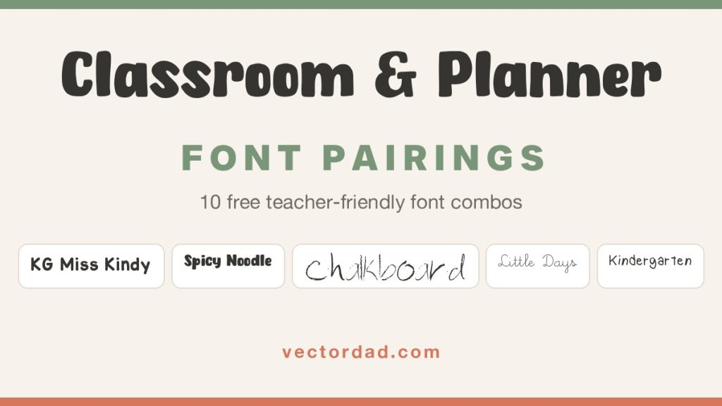
Classroom font pairing is simply the craft of combining two complementary typefaces so each one does a job the other cannot: one characterful display face – bubbly, hand-printed, chalk-dusted or neatly looped – to carry the headline, and one clean, quiet companion to keep the supporting line legible for young readers. Below are five teacher-friendly pairings – every one built from free fonts you can download here on VectorDad – rendered onto a real classroom poster mockup so you can see exactly how each looks before you download a thing.
How to Pair Fonts for a Classroom Poster or Planner: 4 Quick Principles
Before the examples, here are the rules that make a two-font classroom design work. Keep these in mind and you can build teacher lettering far beyond this list.
- Put legibility first. Children are still learning to read, so let the personality live in the big headline and keep the second line in a clean, open sans that stays clear from across the carpet. If a new reader cannot decode it at a glance, simplify.
- Contrast friendly with clean. Pair one expressive, playful display face with a calm, neutral partner. Two decorative fonts fight for attention; a characterful headline over a quiet supporting line reads as organised rather than chaotic.
- Give it room to breathe. Generous spacing is what separates a tidy poster from a cluttered one. Add a little letter-spacing to short caps lines and leave plenty of calm space around the text so the lettering stays crisp once it is laminated.
- Match the mood. Let the display font set the tone – bouncy and rounded for early years, neat hand-printing for a planner, chalk-style for a cosy reading nook – then choose a neutral companion that stays out of its way.
5 Classroom & Planner Font Pairings
1. KG Miss Kindy + Alte Haas Grotesk

Why it works: KG Miss Kindy is a warm, even hand-printed marker face that looks exactly like a favourite teacher’s careful board writing – approachable and unmistakably classroom. Pairing it with the friendly geometric sans Alte Haas Grotesk grounds all that personality so the supporting line stays calm and easy for young eyes – a hand-printed headline over a clean sans is the welcome-poster formula in a nutshell.
Use it for: door welcome posters, cubby and name tags, “all about me” printables, and back-to-school bulletin boards.
2. Spicy Noodle + Just Sans

Why it works: Spicy Noodle is a chunky, bouncy rounded display with a cheerful marker wobble that feels made for early-years crafting. Setting the supporting line in clean, widely spaced Just Sans keeps the lockup playful up top and crisp underneath – bubbly where it counts, clear where it matters.
Use it for: reading-corner signs, classroom job charts, kindergarten centre labels, and “you’ve got this” encouragement prints.
3. Chalkboard + Alte Haas Grotesk

Why it works: Chalkboard is a hand-sketched chalk face with a dusty, just-written texture that instantly conjures a cosy learning nook. Because it is so characterful, it pairs beautifully with the quiet Alte Haas Grotesk, which keeps the message readable beneath all that chalky charm.
Use it for: good-morning greeting boards, daily-schedule signs, reading-nook decor, and “today we are learning” headers.
4. Little Days + Quincy

Why it works: Little Days is a delicate, looping handwritten face that feels like a neatly kept journal – perfect for a planner cover. Anchoring it with the refined small-caps serif Quincy adds a grown-up, keepsake foundation underneath and turns a simple phrase into a balanced planner lockup.
Use it for: weekly and monthly planner covers, teacher binder spines, lesson-plan dividers, and “notes” page headers.
5. Kindergarten + Just Sans

Why it works: Kindergarten is a neat, rounded teaching print – the tidy ball-and-stick lettering children first learn to copy – so it reads as friendly and instructional at once. Pairing it with clean Just Sans caps keeps a personalised line like a teacher’s name clear and professional.
Use it for: personalised teacher-name signs, classroom-door plaques, substitute folder covers, and parent-night handouts.
5 More Classroom Font Pairings to Try
Once you understand the friendly-plus-clean formula, the same handful of fonts remix into plenty more classroom-ready lockups:
- KG Miss Kindy + Just Sans – a hand-printed headline over a geometric sans for a clean, modern welcome sign.
- Spicy Noodle + Alte Haas Grotesk – a bouncy display over a soft sans for a cheerful centre label.
- Kindergarten + Quincy – a teaching print over a refined serif for a polished planner cover.
- Chalkboard + Just Sans – a chalky header over a crisp sans for a daily-schedule board.
- Little Days + Alte Haas Grotesk – a looping script over a friendly sans for a sweet “notes to families” print.
Make Your Classroom Design in Minutes With VectorDad’s Free Tools
You do not need expensive design software to try any of these pairings. Drop your wording into the Word Art Generator to lay out a two-line poster as a clean SVG, bend a phrase like Welcome around a sun or an apple with the Curved Text Generator, or build a two-line lockup in the Vector Quotes Maker. Want a tidy monogram for a binder or cubby? The Monogram Maker has you covered, and the Retro Font Generator is handy for vintage classroom lettering. When you are ready to choose more typefaces, browse the full free font library, or dive into the school, sans-serif and script collections – and always check the commercial-use collection if you plan to sell what you make.
Designing across other formats too? Our companion guides to font pairings for t-shirts, font pairings for wedding invitations, font pairings for logos and branding, farmhouse font pairings, spooky Halloween font pairings and festive Christmas font pairings apply the same character-plus-calm formula to apparel, paper goods, brand identities, rustic decor and seasonal signs. Personalising a gift? Our guide to monogram font pairings applies the same character-plus-calm formula to decorative initials and names.
Putting your lettering on a wall? Our companion guide to bold font pairings for posters and flyers applies the same character-plus-calm formula to event posters, sale flyers and signage.
Classroom Font Pairing FAQ
What fonts are best for a classroom?
Classroom style leans on two families: a characterful display font – bubbly rounded, hand-printed, chalk-style or neatly looped – for the main word, and a clean sans or refined serif for the supporting line. Pair one friendly display face with a quiet companion and you have an instant teacher-ready lockup that young readers can still decode.
How many fonts should a classroom poster use?
Two is the sweet spot: one playful display font for the headline and one clean font for the smaller line. A third typeface almost always makes a poster feel busy and harder for children to read.
Are these classroom fonts free for commercial use?
It varies by font, so always check the license on each product page before you sell what you make. On this list, Alte Haas Grotesk, Spicy Noodle, Little Days, Quincy, Kindergarten and Just Sans are listed with commercial-use terms, while KG Miss Kindy and Chalkboard are free for personal use – confirm the exact terms on each font’s download page before using it on Teachers Pay Teachers or other paid products.
What size and format should a classroom poster or planner be?
Design your lettering as a vector (SVG) so it stays razor-sharp whether you print a small name tag or a full A3 door poster, and it cuts cleanly on a Cricut or Silhouette for vinyl labels. Export a high-resolution PNG with a transparent background for digital planners and printables, and always test the supporting line at the size a child will actually read it.
Can I use these pairings for Cricut and laminated classroom decor?
Absolutely. Every font here downloads as a standard TTF or OTF that installs straight into Cricut Design Space, Silhouette Studio, Canva and any design app, and the SVG word art from VectorDad’s tools drops right onto a cutting mat for clean vinyl labels, cubby tags and laminated signs.
Try one of these five pairings on your next classroom poster or planner page, then remix the same fonts into your own teacher lettering. With the right two typefaces – and the mockups above to guide you – even a single phrase like Welcome to Third Grade can turn a blank sheet into the friendliest thing on the wall.

Pingback: 10 Font Pairings for Logos & Branding (Free Fonts)
Pingback: 10 Farmhouse Font Pairings for Signs & Decor (Free Fonts)
Pingback: 10 Elegant Font Pairings for Wedding Invitations (Free Fonts)
Pingback: 10 Font Pairings for T-Shirts That Sell (Free Cricut Fonts)
Pingback: 10 Spooky Halloween Font Pairings (Free Cricut Fonts)
Pingback: 10 Festive Christmas Font Pairings (Free Fonts for Cricut) - Vectordad Blog
Pingback: Font Pairings That Actually Work: 50+ Free Font Combinations