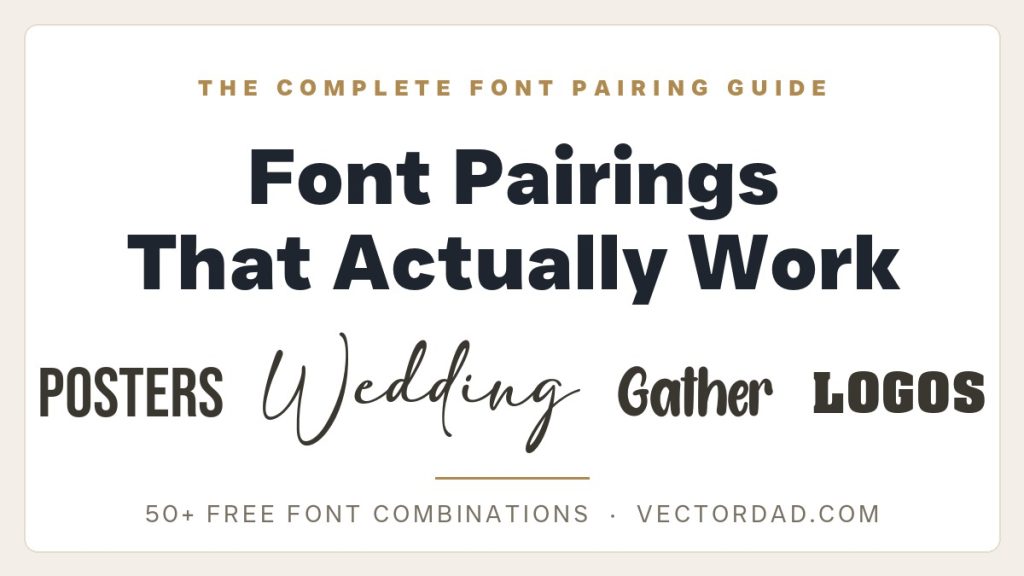
Some font combinations just work. The headline lands, the details stay calm, and the whole thing reads as if a designer planned it – even when it was thrown together in ten minutes. Other pairings feel off in a way that is hard to name: two fonts elbowing each other for attention, or two so similar the design goes flat. The difference almost always comes down to a few simple rules about contrast and hierarchy, plus a little practice spotting which faces play nicely together.
This is the master guide to pairing VectorDad’s free fonts. Below you will find the handful of principles that make every good combination work, a curated showcase of the best pairings drawn from across our whole series – each one rendered in the real, downloadable font files so you can see exactly what you are getting – and a full directory of project-specific guides covering t-shirts, weddings, logos, farmhouse signs, Halloween, Christmas, classrooms, monograms and posters. Every font shown here is free to download on VectorDad, so you can build any of these lockups in minutes.
How Font Pairing Actually Works
You do not need a design degree to pair fonts well. Almost every successful combination – from a wedding invitation to a gig poster – leans on the same four ideas. Learn these once and you can judge any pairing on sight, including ones that are not on this page.
Contrast is the whole game. Good pairings are built on difference, not harmony. Put a bold, characterful display font next to a clean, quiet body font and the contrast does the work: the headline feels loud because the body is calm, and the body feels readable because it is not trying to compete. The fonts that fight are the ones that are too alike – two scripts, two heavy slabs, two geometric sans – because the eye cannot tell which one matters. When in doubt, exaggerate the difference rather than soften it.
Hierarchy tells the reader where to look. Every layout has a most-important line, a second line and some fine print, and your fonts and sizes should make that order obvious in a single glance. Set the display font large for the thing that matters most – the couple’s names, the event, the brand – then drop to a clear, smaller body font for everything else. If two elements are the same size and weight, the reader has to work to figure out what comes first, and most will not bother.
Mood has to match. A font carries a feeling before anyone reads a word. A flowing calligraphy script whispers romance; a chunky slab shouts a sale; a weathered brush face feels rustic and handmade; a high-contrast Didone reads expensive. Pick a display font whose mood fits the job, then choose a body font that agrees with it – a refined serif under an elegant script, a friendly geometric sans under a playful marker. A mismatch in mood is the fastest way to make a design feel wrong even when the fonts are individually lovely.
Limit yourself to two. One display font and one body font is all most projects ever need. A third typeface almost always muddies the hierarchy and makes the whole thing look busy and amateur. If you want more variety, get it from your existing two fonts by changing size, weight, colour or letter-spacing rather than reaching for a new face. Two fonts, used with confidence, beat four fonts used nervously every time.
The Best Free Font Pairings From the Series
Here are eight of our favourite pairings, one for each kind of project, every one built from free VectorDad fonts and shown in the real typefaces below. Use them as ready-made combinations or as a starting point for your own.
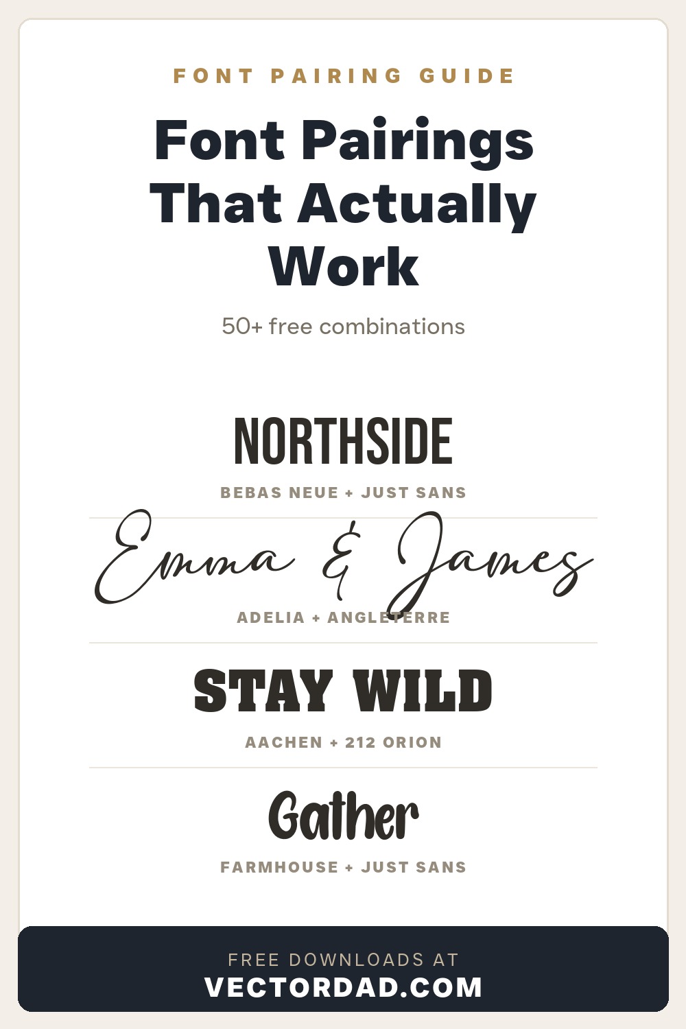
1. Bebas Neue + Just Sans
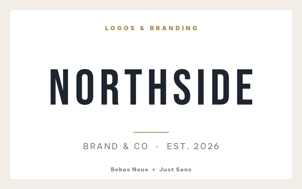
Why it works: Bebas Neue is a tall, condensed all-caps sans that reads clean and confident – the workhorse behind countless modern wordmarks. Setting the supporting line in the friendly geometric Just Sans, spaced out and quiet beneath it, lets the name own the spotlight while the tagline stays effortlessly readable. It is the classic “loud name, calm tagline” lockup. Pulled from our logo and branding font pairings.
2. Aachen + 212 Orion Sans
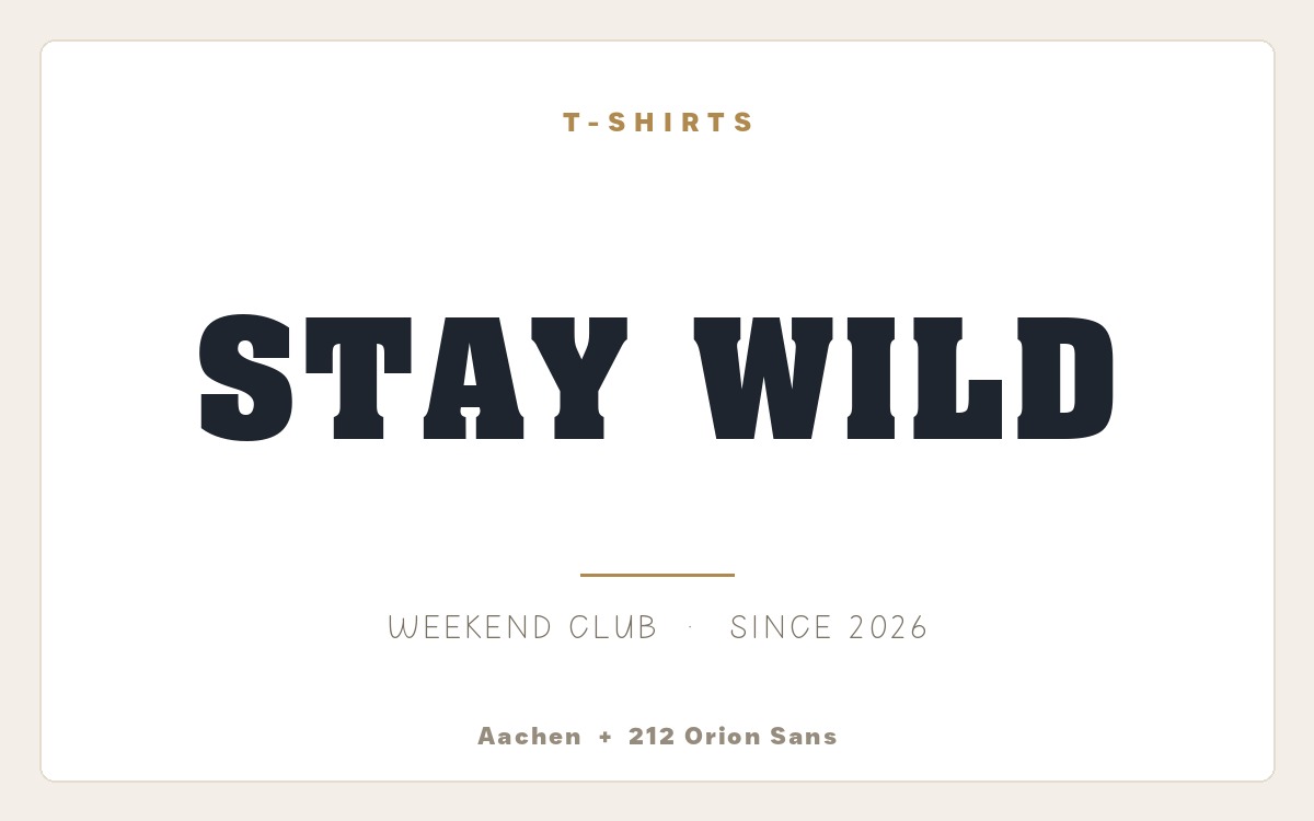
Why it works: Aachen is a chunky, rounded slab serif that reads loud and friendly – perfect for a punchy front-of-shirt headline. The light, casual hand-style of 212 Orion Sans cools things right down underneath, so the slogan gets all the attention while the smaller line stays easy to read. A bold-over-casual combination made for apparel. Pulled from our t-shirt font pairings.
3. Adelia + Angleterre Book
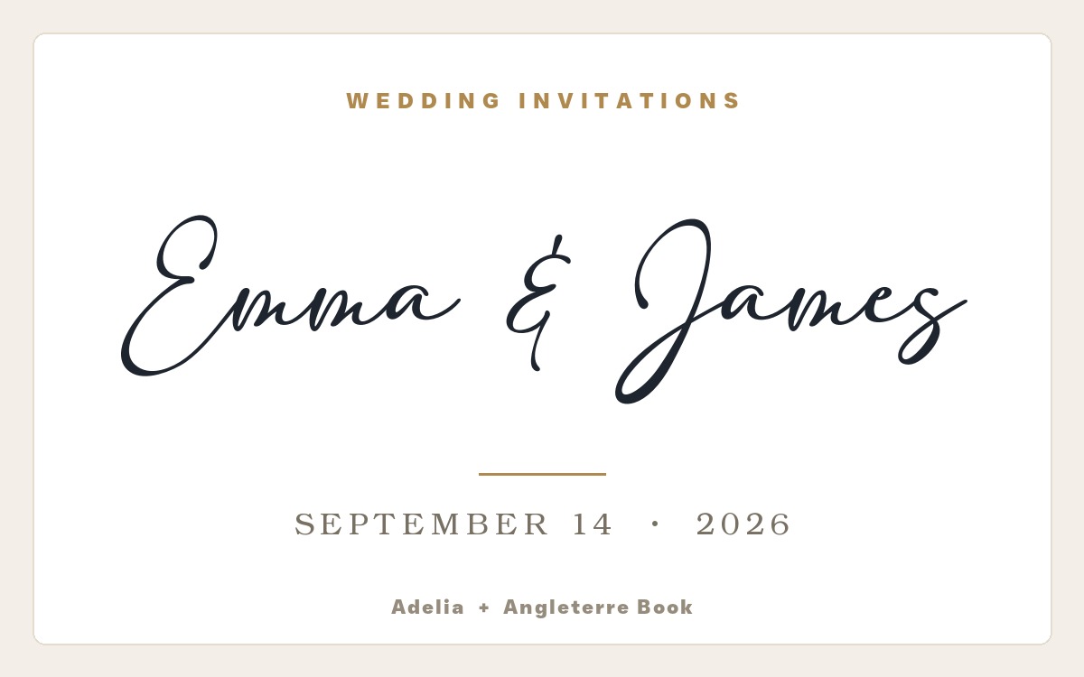
Why it works: Adelia is a flowing, modern calligraphy script with graceful, generous loops – the kind of hand that makes two names feel like a vow. Anchoring the date and details in the refined classical serif Angleterre Book brings a sense of formality and balance, so the romance up top is grounded by quiet, readable structure below. Pulled from our wedding invitation font pairings.
4. FarmHouse + Just Sans
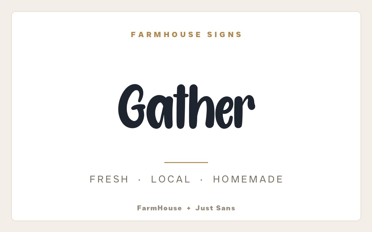
Why it works: FarmHouse is a chunky, rounded brush script with genuine hand-painted charm – the quintessential “Gather” sign font. Pairing it with clean, widely spaced Just Sans caps grounds all that personality so the supporting line stays calm and effortlessly readable. A bouncy script over a quiet geometric sans is the heart of the whole modern-farmhouse look. Pulled from our farmhouse font pairings.
5. White Christmas + Just Sans
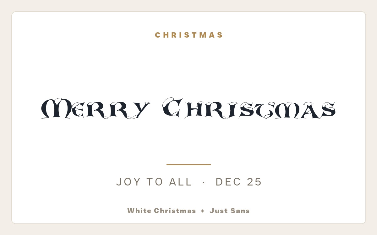
Why it works: White Christmas is a soft, brushy holiday script with a hand-painted, snow-dusted feel that instantly reads as Christmas Eve by the fire. Pairing it with clean, widely spaced Just Sans caps keeps the supporting line calm and modern, so the cosy script headline gets to be the star without the layout turning fussy. Pulled from our Christmas font pairings.
6. American Horror Story + Just Sans
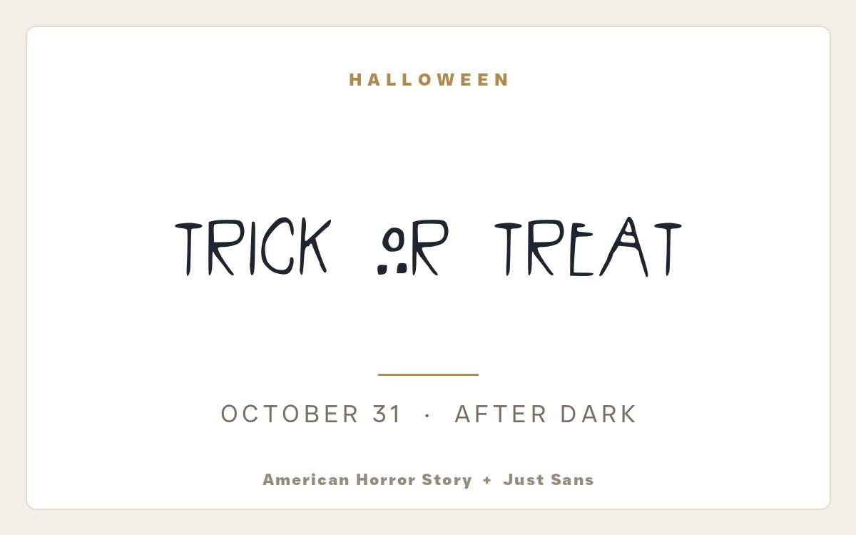
Why it works: American Horror Story is a thin, scratched, faintly unsettling title face with the eerie restraint of a horror-show logo. Pairing it with clean, widely spaced Just Sans caps grounds all that dread so the supporting line stays calm and effortlessly readable – a creepy headline over a quiet geometric sans. Pulled from our Halloween font pairings.
7. KG Miss Kindy + Alte Haas Grotesk
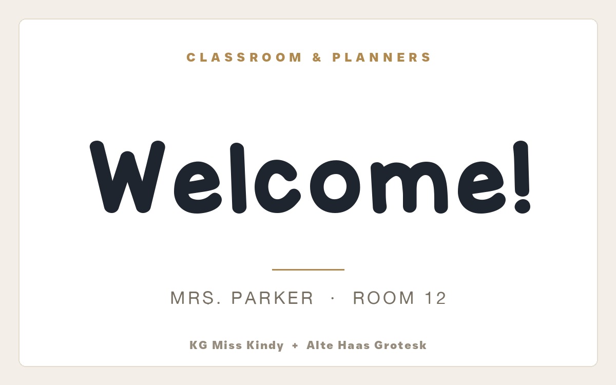
Why it works: KG Miss Kindy is a warm, even hand-printed marker face that looks exactly like a favourite teacher’s careful board writing – approachable and unmistakably classroom. Pairing it with the friendly geometric sans Alte Haas Grotesk grounds all that personality so labels, names and details stay tidy and legible. Pulled from our classroom and planner font pairings.
8. Roman Monogram + Champignon
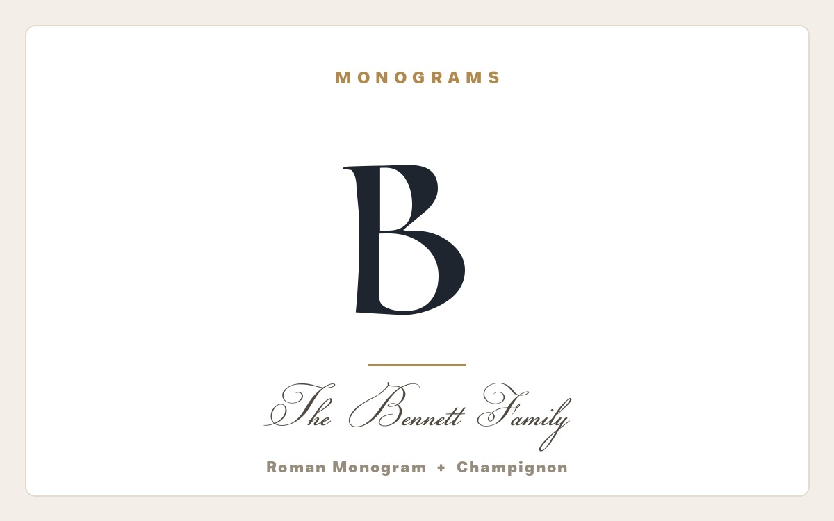
Why it works: Roman Monogram is a high-contrast Didone-style capital with elegant thick-and-thin strokes that look expensive at any size – the classic “big initial” letter. Pairing it with the formal calligraphy of Champignon keeps the family name flowing and refined beneath it, so a single letter and a surname feel like a crest. Pulled from our monogram font pairings.
Font Pairings by Use Case
Every project has its own rules. Pick the guide that matches what you are making – each one applies the same contrast-and-calm formula to a specific job, with ten real-font pairings and mockups inside.
- Font pairings for t-shirts – bold, readable combinations built to sell on apparel and cut cleanly in Cricut Design Space.
- Font pairings for wedding invitations – elegant script-and-serif lockups for save-the-dates, invites and place cards.
- Font pairings for logos and branding – confident wordmark-and-tagline combinations that make a brand feel intentional.
- Farmhouse font pairings – bouncy brush scripts over quiet sans for “Gather” signs, decor and rustic prints.
- Halloween font pairings – spooky display faces paired with clean type for party invites and signs.
- Christmas font pairings – festive holiday scripts and calm body fonts for cards, tags and ornaments.
- Classroom and planner font pairings – friendly teacher fonts for labels, worksheets, bulletin boards and planners.
- Monogram font pairings – decorative initials and flowing scripts for personalised gifts and crests.
- Poster and flyer font pairings – high-impact display headlines over readable body type for events and sales.
Build Your Own Pairings With VectorDad’s Free Tools
You do not need expensive software to try any of these combinations. Set a headline and a supporting line in any of these faces with the Font Generator, lay out a full multi-line design as a clean SVG in the Word Art Generator, curve a name or banner with the Curved Text Generator, or build a polished quote lockup in the Vector Quotes Maker. Every pairing above pulls from the free VectorDad font library, so you can download both faces and start designing in minutes.
Font Pairing FAQ
How many fonts should I pair together?
Two is the sweet spot: one display font for the headline and one simple font for everything else. A third typeface almost always blurs the hierarchy and makes a layout feel busy. If you need more variation, change the size, weight, colour or letter-spacing of your two fonts rather than adding a new one.
Can I pair these free fonts for commercial projects?
It varies by font, so always check the license on each font’s product page before you sell what you make. Many faces in this guide, including Bebas Neue, Just Sans and Alte Haas Grotesk, are free for personal use, while several are marked personal-use only – so confirm the terms on the font page before any commercial print run or product listing.
What is the best font pairing for my project?
Start with the display font that matches your mood, then add a calm body font for contrast. For a brand, try Bebas Neue with Just Sans; for a wedding, Adelia with Angleterre Book; for a rustic sign, FarmHouse with Just Sans. The use-case guides above have ten tested options for each kind of project.
What tools can I use to test font pairings?
You can preview any of these fonts together for free with VectorDad’s browser tools – the Font Generator for quick headlines, the Word Art Generator for full layouts, and the Vector Quotes Maker for multi-line lockups. They all export clean files you can drop straight into Canva, Cricut Design Space or any design app.
How do I know if two fonts work together?
Ask two questions: is there enough contrast, and do the moods match? If one font is clearly the loud display face and the other is a calm, neutral body font – and both feel like they belong at the same event – the pairing will work. If they are too similar, or one feels formal while the other feels casual, keep looking.
Two Fonts, Done Right
Great type pairing is mostly confidence: pick one display font with character, give it the spotlight, and let a quiet body font carry the details underneath. Every combination on this page is built from free fonts you can download on VectorDad and drop straight into your next design. Start with one of the eight pairings above, explore the use-case guide that matches your project, and you will never stare at a font menu wondering what goes with what again.
Planning to sell what you make? Before you build a product around a pairing, double-check that both fonts are cleared for commercial use. Our companion guide to 16 free commercial-use fonts (with verified licenses) explains what a commercial license actually allows for Cricut and Etsy sellers.
Pingback: 10 Font Pairings for T-Shirts That Sell (Free Cricut Fonts)
Pingback: 10 Bold Font Pairings for Posters & Flyers (Free Fonts)
Pingback: 10 Monogram Font Pairings for Personalized Gifts (Free Fonts)
Pingback: 10 Festive Christmas Font Pairings (Free Fonts for Cricut) - Vectordad Blog
Pingback: 10 Elegant Font Pairings for Wedding Invitations (Free Fonts)
Pingback: 16 Free Commercial-Use Fonts (Verified Licenses) - VectorDad