A poster has one job: stop someone mid-stride and make them read the date. You get a few feet of distance and a couple of seconds, so the lettering has to do the heavy lifting. The two fonts you choose – the big display headline up top and the calm body font carrying the details – decide whether a flyer reads as a polished event you want to attend or a noticeboard scrap the eye slides right past.
This post is part of our complete font pairing guide – a hub of the best free font combinations for every project.
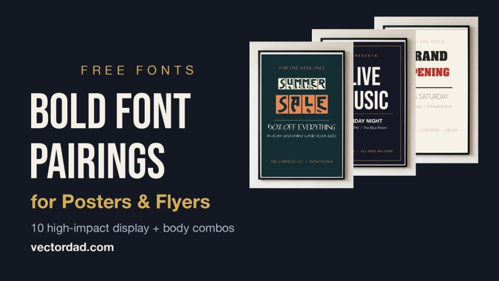
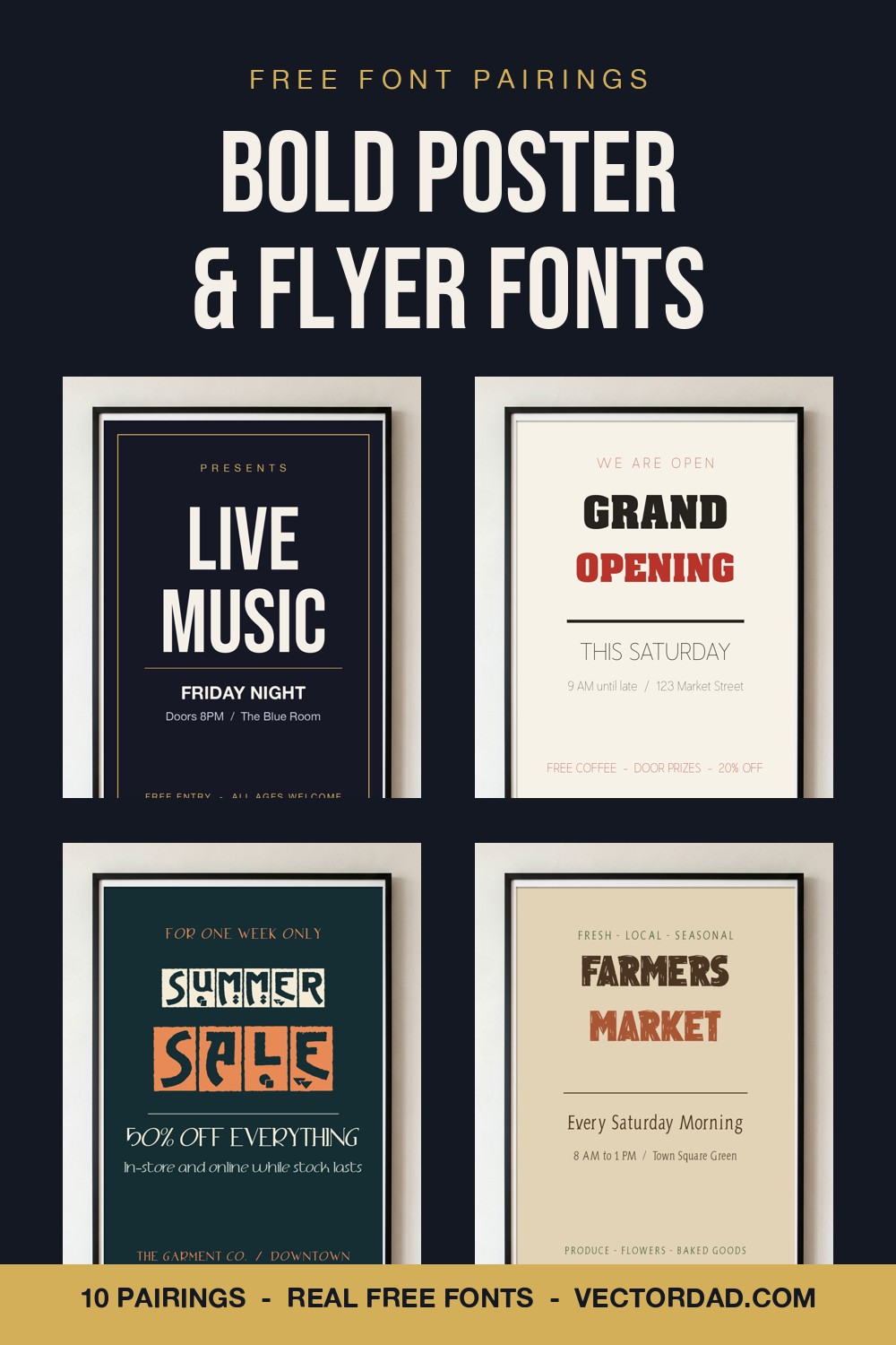
Poster font pairing is the craft of combining one high-impact display font – a tall condensed sans, a heavy slab, a vintage gothic or an elegant Didone – with one clean body font that keeps the time, place and price instantly readable. Below are five bold pairings, every one built from free fonts you can download here on VectorDad, rendered onto a real framed-poster mockup so you can see exactly how each lockup looks on a wall before you download a thing.
How to Pair Fonts for a Poster or Flyer
Posters live or die on hierarchy and contrast. A handful of principles make every pairing on this list work, and they will carry you far beyond these five.
Build a clear hierarchy. A reader should catch your message in three jumps: the event name first, the key detail (date, offer, headline act) second, the fine print last. Set the display font large for line one, drop the body font to a clear mid-size for the detail, and keep the small print genuinely small. If everything shouts, nothing lands.
Lead with impact. The display font is your billboard. Give it room, set it big and bold, and let a condensed, heavy or characterful face own the top third of the poster. From across a room, that headline is the only thing working – so make it unmissable.
Contrast loud with quiet. Pair one expressive display face with one calm, neutral body font. Two attention-seeking fonts fight each other; a bold headline over a quiet sans or refined serif reads as confident and designed rather than cluttered.
Match the mood. A condensed gothic feels like a gig, a heavy slab feels like a sale, a Didone feels like a gala and a weathered face feels like a market. Choose a body font that echoes that mood – humanist sans for music, geometric sans for retail, a refined serif for elegant, a sturdy serif for rustic.
5 Bold Poster & Flyer Font Pairings
1. Bebas Neue + Alte Haas Grotesk
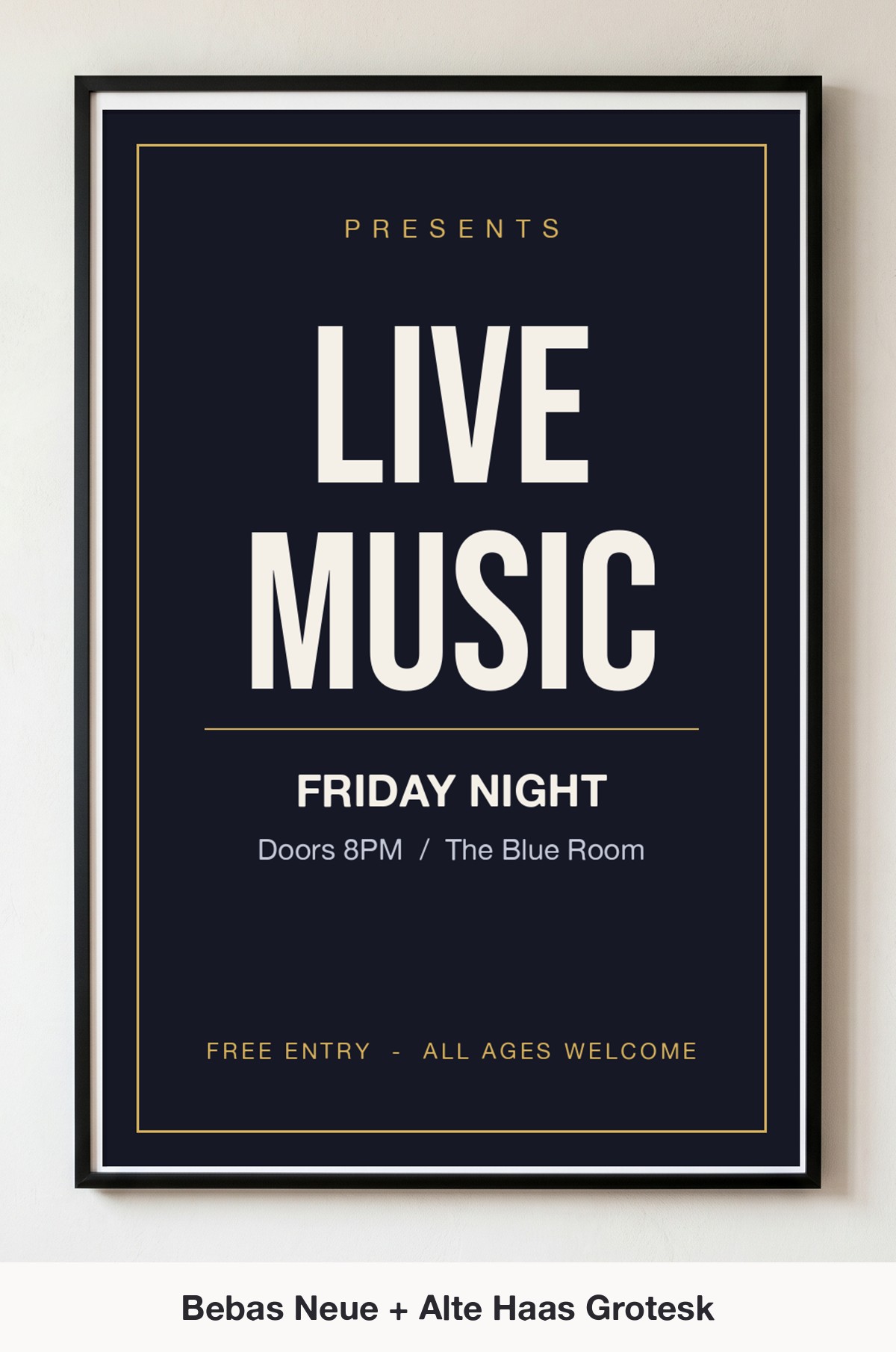
Why it works: Bebas Neue is the definitive gig-poster headline – tall, condensed all-caps that stacks into a dense, dramatic block. Setting the details in the warm, humanist Alte Haas Grotesk keeps the date and venue friendly and legible, so the towering headline gets all the drama while the body stays effortless to read.
Use it for: concert and gig posters, club nights, open-mic flyers, festival line-ups, and any event where the name needs to fill the wall.
2. Aachen + Nugo Sans
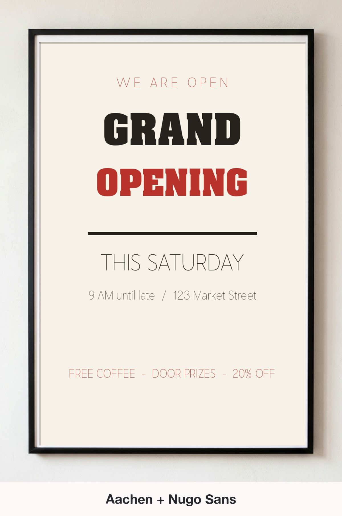
Why it works: Aachen is a heavy, tightly-spaced slab with serious retail punch – it reads as “big news” from across a parking lot. Pairing it with the light, geometric Nugo Sans opens the supporting lines right up, so the chunky headline feels bold without the whole poster turning heavy.
Use it for: grand-opening and sale announcements, retail window posters, real-estate flyers, and bold promotional signage.
3. Advertising Gothic + Adolphus Serif
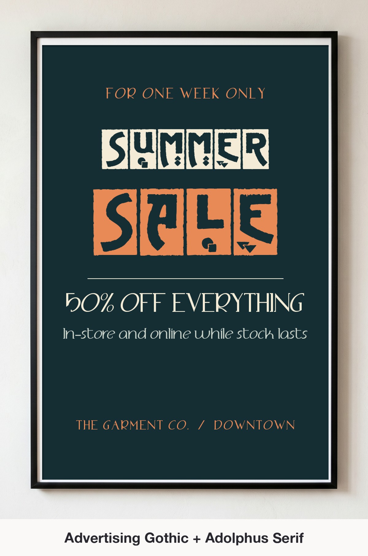
Why it works: Advertising Gothic is a decorative, inlaid display face with genuine vintage-poster character – the kind of lettering you see on old fairground and sale bills. Anchoring it with the refined Adolphus Serif keeps the smaller lines elegant and readable, so the showy headline feels curated rather than chaotic.
Use it for: sale and promotion posters, vintage market flyers, retro event bills, and anything with a nostalgic, hand-lettered feel.
4. Imperium Serif + Just Sans
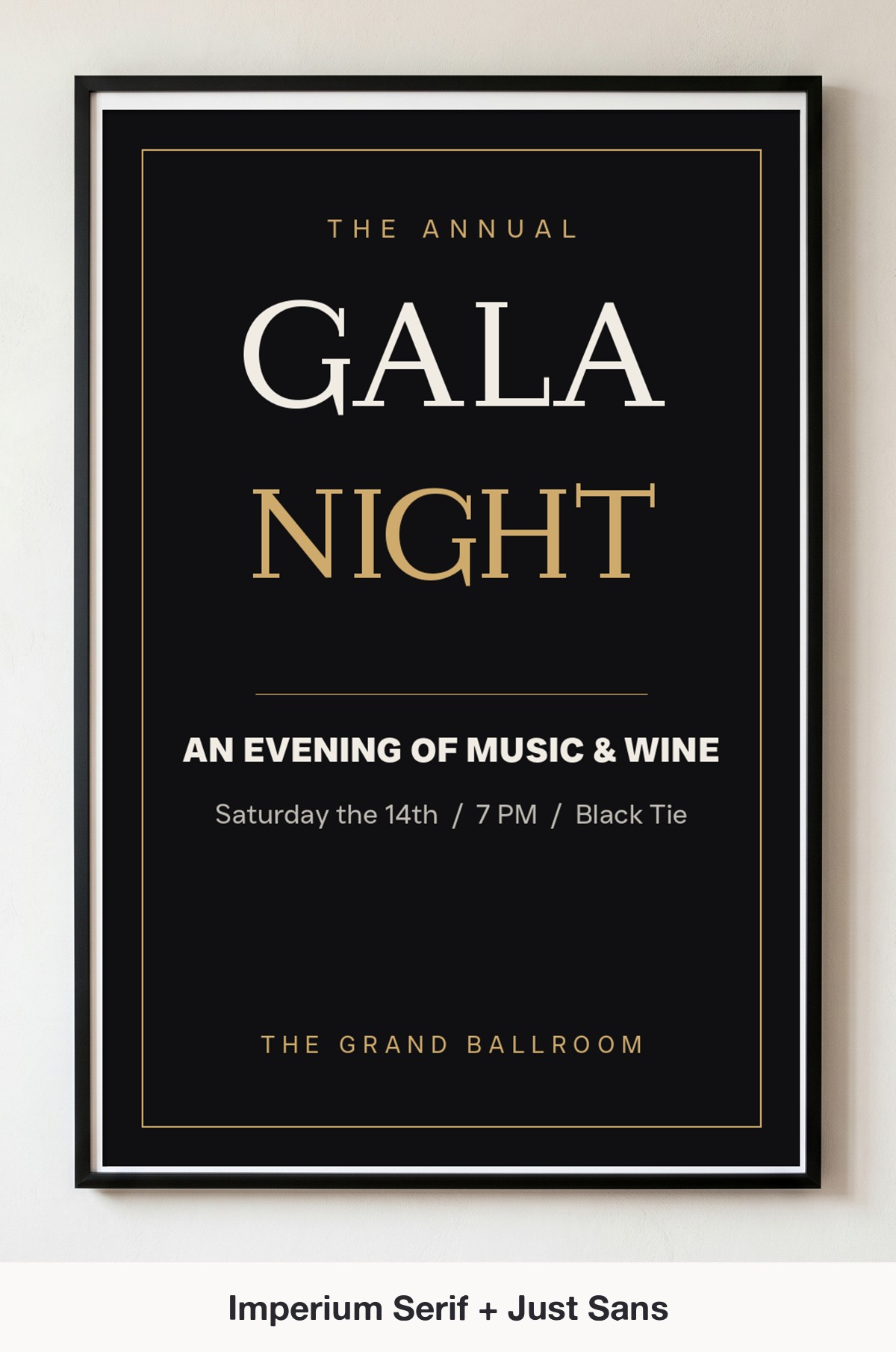
Why it works: Imperium Serif is a high-contrast Didone display face – thin hairlines and dramatic thicks that instantly read formal and upscale. Setting the details in the clean, geometric Just Sans grounds all that elegance with modern clarity, the classic high-low pairing behind most gala and luxury-event lettering.
Use it for: gala and fundraiser posters, fashion and product launches, fine-dining menus, and elegant invitation flyers.
5. Dusty Ranch + Aida Serif
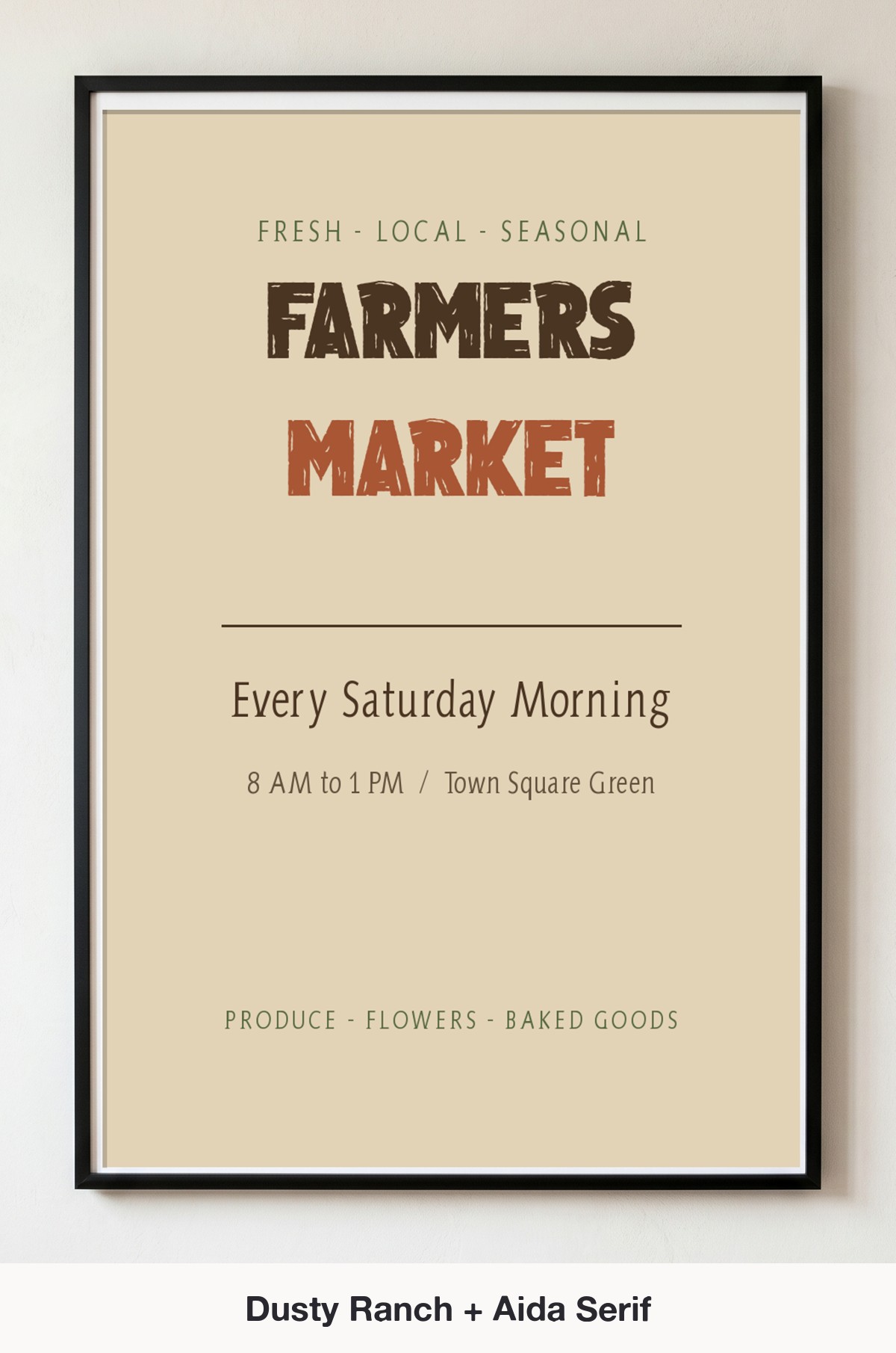
Why it works: Dusty Ranch is a sturdy, weathered display face with rugged, hand-painted warmth – perfect for anything rustic or outdoors. The condensed Aida Serif packs the supporting details into tidy, characterful lines that echo the vintage mood without competing with the headline.
Use it for: farmers’ market and craft-fair flyers, BBQ and rodeo posters, rustic event signage, and small-town community bills.
5 More Bold Poster Pairings to Try
Once the character-plus-calm formula clicks, the combinations are endless. Here are five more poster-ready pairings worth downloading:
- Freshman + Conde Sans – a collegiate block over a clean sans for sports and pep-rally flyers.
- Varsity + 212 Orion Sans – a striped athletic face over a tidy geometric sans for team and tournament posters.
- Buguri Slab + Alexandria – a chunky slab over a sturdy sans for workshops and conference signage.
- Chenile Deluxe + Just Sans – a retro monoline script over a modern sans for open-house and reunion flyers.
- Advertising Gothic + Nugo Sans – a vintage display over an airy light sans for market and festival bills.
Make Your Poster in Minutes With VectorDad’s Free Tools
You do not need expensive design software to try any of these pairings. Lay out a bold headline-and-detail poster as a clean SVG in the Word Art Generator, curve a banner or event name with the Curved Text Generator, build a polished multi-line lockup in the Vector Quotes Maker, or set a quick headline in any of these faces with the Font Generator. Every pairing above pulls from the free VectorDad font library, so you can download both faces and start designing in minutes.
Hunting for a different vibe? The same character-plus-calm formula drives our other guides: font pairings for t-shirts, font pairings for wedding invitations, font pairings for logos and branding, farmhouse font pairings, spooky Halloween font pairings, festive Christmas font pairings, classroom and planner font pairings and monogram font pairings apply it to apparel, paper goods, brand identities, rustic decor, seasonal signs, teacher lettering and personalised gifts.
Poster Font Pairing FAQ
What font is best for a poster?
The best poster fonts are bold display faces that read from a distance – tall condensed sans like Bebas Neue, heavy slabs like Aachen, or characterful vintage faces like Advertising Gothic. Pair one of them with a clean body font so the headline grabs attention while the details stay readable.
How many fonts should I use on a poster?
Two is the sweet spot: one bold display font for the headline and one simple font for the details. A third typeface almost always muddies the hierarchy and makes the layout feel busy. If you need more variation, change the size, weight or colour of your two fonts rather than adding a new one.
Are these poster fonts free for commercial use?
It varies by font, so always check the license on each product page before you sell what you make. Several faces on this list, including Bebas Neue, Alte Haas Grotesk, Nugo Sans, Imperium Serif and Just Sans, are free for personal use, while a few are marked personal-use only – so confirm the terms on the font page before any commercial print run.
What size should a poster headline be?
Make the headline the biggest thing on the page by a wide margin – as a rule of thumb, the display line should be at least three to four times the size of your body text. That gap is what creates instant hierarchy and lets the poster work from across a room.
Bold Lettering, Free Fonts
Great poster design is mostly about confidence: pick one bold display font, give it the whole top of the page, and let a quiet body font carry the details underneath. Every pairing here is built from free fonts you can download on VectorDad and drop straight into Canva, Cricut Design Space or any design app.
Try one of these five pairings on your next poster or flyer, then remix the same fonts into your own headline-and-detail lockups. With the right display face, a calm body font, and the mockups above to guide you, even a single sheet of paper can stop someone in their tracks.
Pingback: 10 Font Pairings for T-Shirts That Sell (Free Cricut Fonts)
Pingback: 10 Font Pairings for Logos & Branding (Free Fonts)
Pingback: 10 Elegant Font Pairings for Wedding Invitations (Free Fonts)
Pingback: 10 Farmhouse Font Pairings for Signs & Decor (Free Fonts)