A great Halloween design lives or dies on contrast – the thrill of something creepy balanced by a line you can actually read in the dark. Whether you are cutting a vinyl sign for the front porch, printing a costume-party invite, or lettering a trick-or-treat tote on your Cricut, the two fonts you choose set the entire mood. Pick the right spooky-plus-simple pairing and even a plain phrase like Enter If You Dare suddenly looks like it belongs on a haunted-house door.
This post is part of our complete font pairing guide – a hub of the best free font combinations for every project.
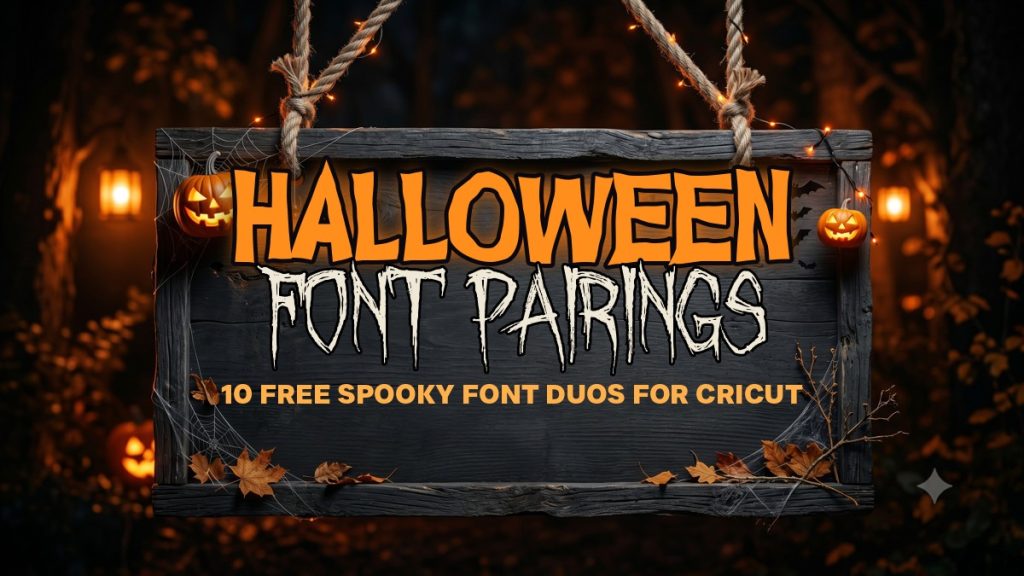
Halloween font pairing is simply the craft of combining two complementary typefaces so each one does a job the other cannot: one dramatic display face – scratched, carved, vintage or witchy – to carry the headline, and one clean, quiet companion to keep the supporting line legible. Below are five Halloween pairings – every one built from free fonts you can download here on VectorDad – rendered onto a real spooky wood-sign mockup so you can see exactly how each looks before you download a thing.
How to Pair Fonts for a Halloween Sign or Poster: 4 Quick Principles
Before the examples, here are the rules that make a two-font Halloween design work. Keep these in mind and you can build spooky lettering far beyond this list.
- Contrast spooky with simple. Pair one expressive horror or display face with a calm, neutral partner. Two decorative fonts fight each other; a dramatic headline over a quiet supporting line reads as intentional rather than chaotic.
- Protect legibility. Halloween display fonts are full of texture – drips, cracks and jagged edges – so let the personality live in the big word and keep the second line in a clean sans or serif that stays readable across a dark room.
- Give it room to breathe. Generous spacing is what separates a polished poster from a cluttered one. Add a little letter-spacing to short caps lines and leave plenty of dark space around the text so the glow and the lettering both land.
- Match the mood. Let the display font set the tone – jagged and eerie for a horror party, vintage and carved for a classy haunt, bouncy and witchy for a kid-friendly bash – then choose a neutral companion that stays out of its way.
5 Spooky Halloween Font Pairings
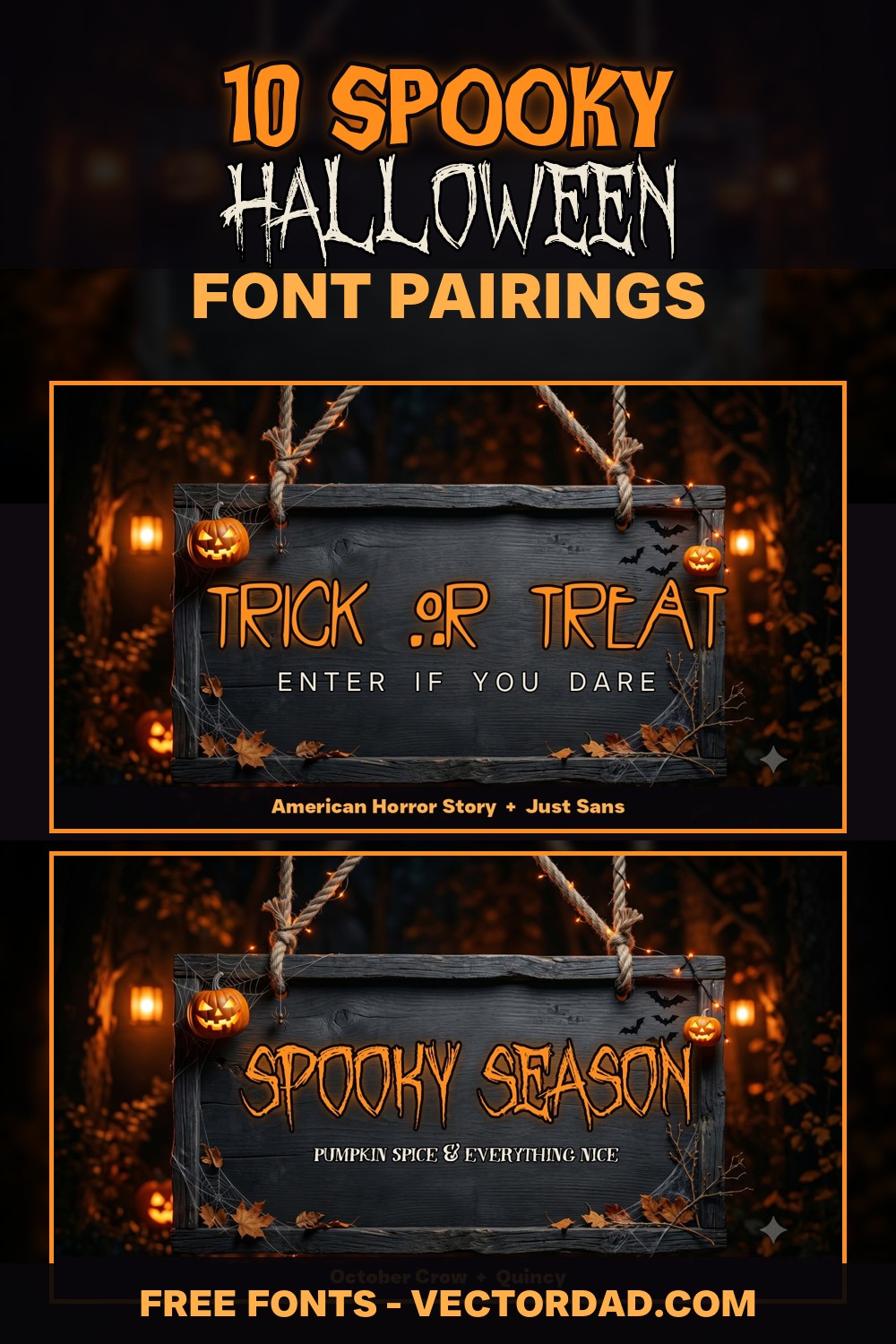
1. American Horror Story + Just Sans
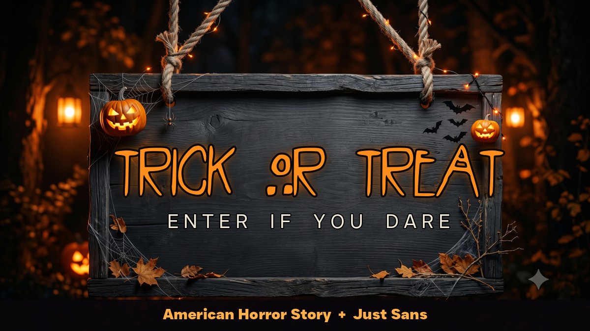
Why it works: American Horror Story is a thin, scratched, faintly unsettling title face with the eerie restraint of a horror-show logo. Pairing it with clean, widely spaced Just Sans caps grounds all that dread so the supporting line stays calm and effortlessly readable – a creepy headline over a quiet geometric sans is the modern-horror formula in a nutshell.
Use it for: haunted-house signs, “enter if you dare” door cards, horror movie-night invites, and eerie gallery-wall posters.
2. Ghoulish Fright AOE + Quincy
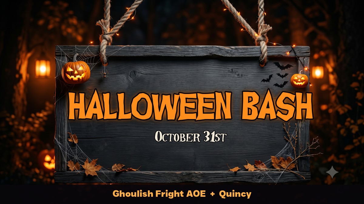
Why it works: Ghoulish Fright AOE is a bold, brushy horror display with thick, uneven strokes that look hand-painted by candlelight. Because it is so heavy, it needs a refined partner, and the vintage serif Quincy delivers, keeping the date crisp and elegant beneath the dripping headline.
Use it for: Halloween bash invitations, costume-party flyers, October event signage, and spooky bar or menu boards.
3. October Crow + Quincy
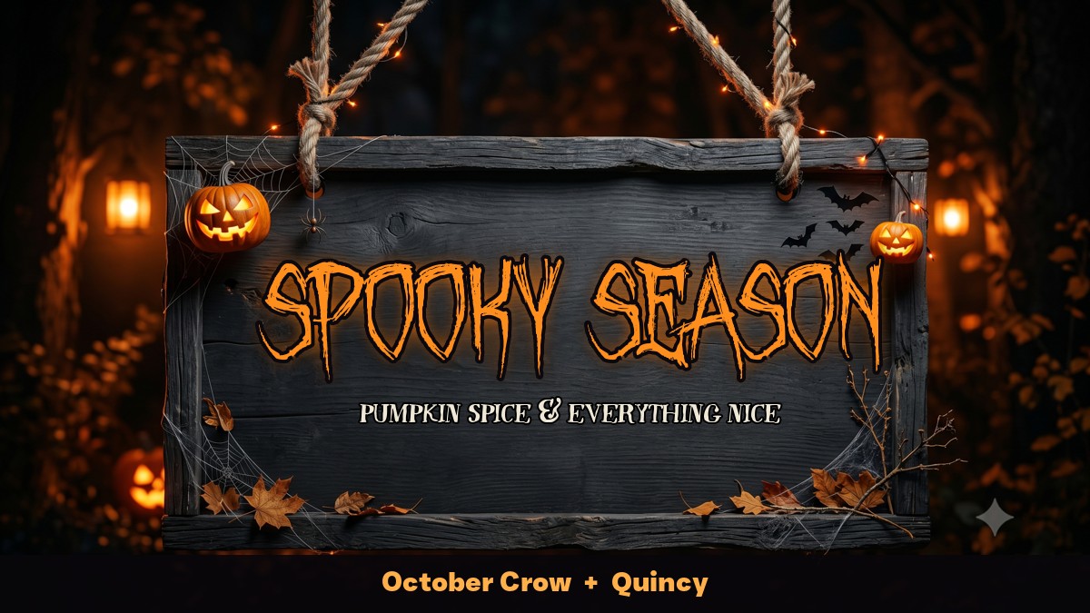
Why it works: October Crow is a tall, condensed display with a vintage carnival-of-horrors character – dramatic without tipping into gore. Pairing it with Quincy‘s refined serif adds an old-poster polish underneath and turns a moody headline into a balanced, keepsake-worthy lockup.
Use it for: “spooky season” decor, autumn-meets-Halloween signs, pumpkin-patch printables, and seasonal shop displays.
4. Curly Witch + Just Sans
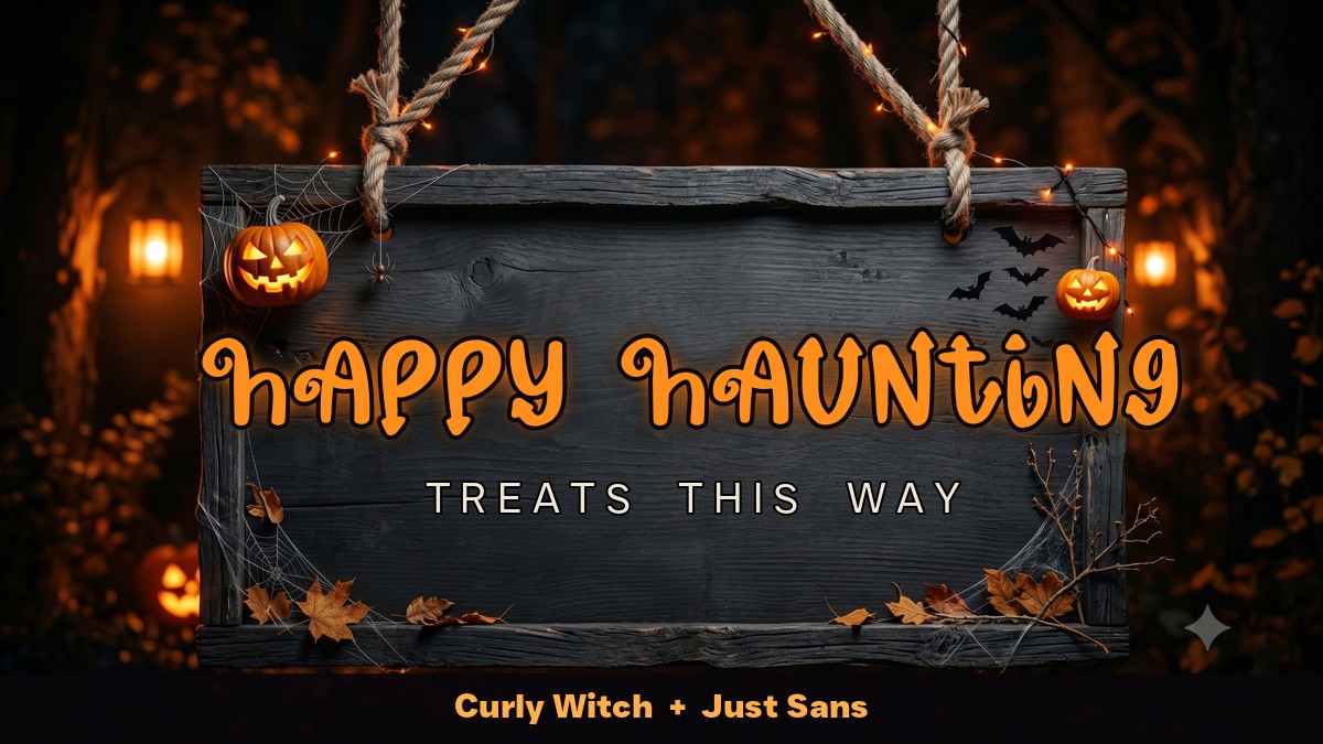
Why it works: Curly Witch is a playful, swirling hand-drawn face with friendly curls – more whimsical than frightening, which makes it perfect for kid-friendly Halloween. Anchoring it with spaced Just Sans caps keeps the message clear so the script can stay loose and charming.
Use it for: children’s Halloween parties, classroom decor, trick-or-treat signs, and candy-station labels.
5. Secret Halloween + Just Sans
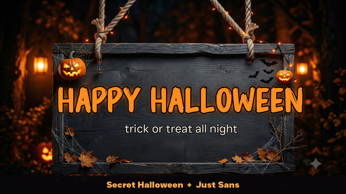
Why it works: Secret Halloween is a chunky, bouncy Halloween display with just enough spook to feel festive rather than scary. Setting the supporting line in clean Just Sans keeps the lockup friendly and crisp – cheerful up top, clear underneath.
Use it for: front-porch welcome signs, neighborhood trick-or-treat maps, Halloween tees, and party banners.
5 More Halloween Font Pairings to Try
Once you understand the spooky-plus-simple formula, the same seven fonts remix into plenty more Halloween-ready lockups:
- American Horror Story + Quincy – a scratched title over a vintage serif for a classic haunted-house poster.
- Ghoulish Fright AOE + Just Sans – a brushy horror headline over clean caps for a modern costume-party flyer.
- October Crow + Just Sans – a tall vintage display over a neutral sans for an easygoing spooky-season sign.
- Curly Witch + Quincy – a whimsical witchy script over a serif for a sweeter kids’ Halloween invite.
- Secret Halloween + Quincy – a friendly Halloween face over a vintage serif for a trick-or-treat plaque.
Make Your Halloween Design in Minutes With VectorDad’s Free Tools
You do not need expensive design software to try any of these pairings. Drop your wording into the Word Art Generator to lay out a two-line sign as a clean SVG, bend a phrase like Trick or Treat around a moon with the Curved Text Generator, or build a two-line lockup in the Vector Quotes Maker. Want a spooky monogram for the center of a wreath? The Monogram Maker has you covered, and the Retro Font Generator is perfect for vintage Halloween lettering. When you are ready to choose more typefaces, browse the full free font library, or dive into the script, serif and sans-serif collections – and always check the commercial-use collection if you plan to sell what you make. For more frights, the Halloween font collection and horror font collection are packed with seasonal display faces.
Designing across other formats too? Our companion guides to font pairings for t-shirts, font pairings for wedding invitations, font pairings for logos and branding and farmhouse font pairings, plus our classroom & planner font pairings guide, apply the same character-plus-calm formula to apparel, paper goods, brand identities and rustic decor. And if you are building a whole Halloween project, pair these fonts with our Halloween SVG cut files and Halloween coloring pages for a coordinated spooky set. And when the holidays roll around, dress your designs in our festive Christmas font pairings. Personalising a gift? Our guide to monogram font pairings applies the same character-plus-calm formula to decorative initials and names.
Putting your lettering on a wall? Our companion guide to bold font pairings for posters and flyers applies the same character-plus-calm formula to event posters, sale flyers and signage.
Halloween Font Pairing FAQ
What fonts are best for Halloween?
Halloween style leans on two families: dramatic display and horror fonts – scratched title faces, carved gravestone letters, brushy ghoulish display and witchy hand-drawn scripts – for the main word, and clean sans or vintage serif fonts for the supporting line. Pair one expressive display face with a quiet companion and you have an instant Halloween lockup.
How many fonts should a Halloween design use?
Two is the sweet spot: one characterful display font for the headline and one clean font for the smaller line. A third typeface almost always makes a poster feel busy and harder to read in low light.
Are these Halloween fonts free for commercial use?
It varies by font, so always check the license on each product page before you sell what you make. On this list, Ghoulish Fright AOE, October Crow, Curly Witch, Secret Halloween, Just Sans and Quincy are listed as free downloads, while American Horror Story is a display title font best treated as personal-use or demo – confirm the exact terms on each font’s download page before using it commercially.
What size and format should a Halloween sign or poster be?
Design your lettering as a vector (SVG) so it stays razor-sharp at any size and cuts cleanly on a Cricut or Silhouette for vinyl signs and decals. Export a high-resolution PNG with a transparent background for digital mockups, invitations and print-on-demand, and always test the supporting line at the size it will actually be read.
Can I use these pairings for Cricut and vinyl projects?
Absolutely. Every font here downloads as a standard TTF or OTF that installs straight into Cricut Design Space, Silhouette Studio and any design app, and the SVG word art from VectorDad’s tools drops right onto a cutting mat for clean vinyl decals, stencils and iron-on Halloween shirts.
Try one of these five pairings on your next Halloween project, then remix the same fonts into your own spooky lettering. With the right two typefaces – and the mockups above to guide you – even a single phrase like Trick or Treat can turn a blank sign into the creepiest thing on the block.
Pingback: 10 Font Pairings for T-Shirts That Sell (Free Cricut Fonts)
Pingback: 10 Elegant Font Pairings for Wedding Invitations (Free Fonts)
Pingback: 10 Font Pairings for Logos & Branding (Free Fonts)
Pingback: 10 Festive Christmas Font Pairings (Free Fonts for Cricut) - Vectordad Blog
Pingback: 10 Farmhouse Font Pairings for Signs & Decor (Free Fonts)