A wedding invitation is the first real glimpse your guests get of the day you have been dreaming up – and almost all of that first impression rides on the lettering. The same two names set in a tired default font feel like a reminder notice; set in a confident type pairing, they feel like an occasion. With invitations you are usually working with just a handful of words – two names, a date, a line of welcome – so the fonts have to carry nearly all of the romance and all of the formality.
This post is part of our complete font pairing guide – a hub of the best free font combinations for every project.
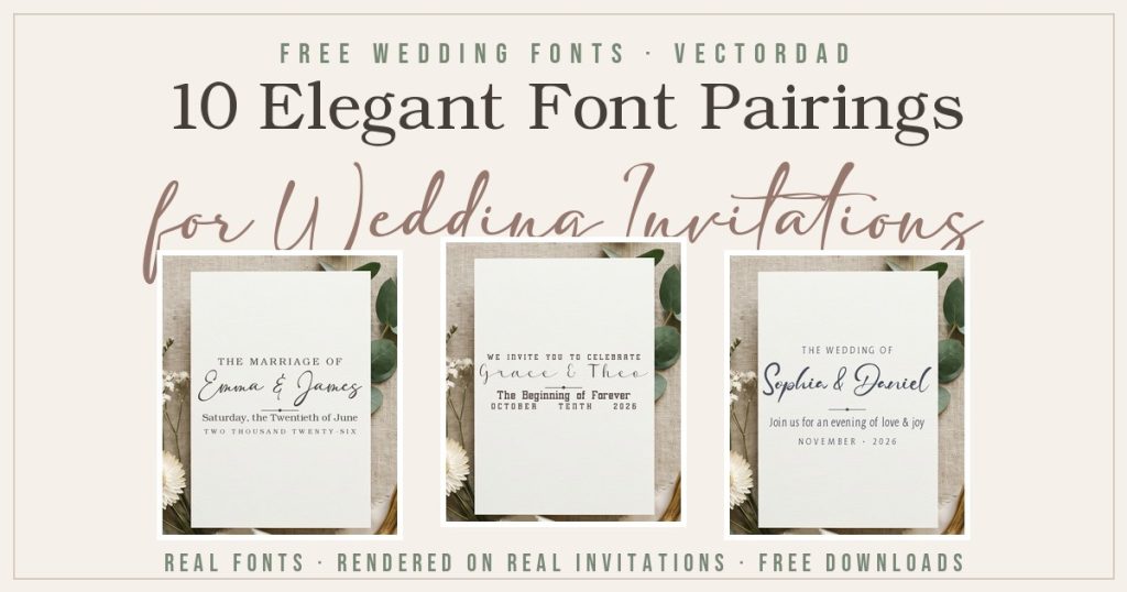
Font pairing is simply the craft of combining two complementary typefaces so each one does a job the other cannot. On an invitation that almost always means one expressive script or calligraphy face to carry the couple’s names, and one calm, classic serif or sans to keep the details perfectly readable. Get that balance right and even a single ivory card looks like it came straight from a boutique stationer. Below are five pairings – every one built from free fonts you can download here on VectorDad – with the actual fonts rendered onto invitation mockups so you can see exactly what you are getting before you download a thing.
How to Pair Fonts for Wedding Invitations: 4 Quick Principles
Before the examples, here are the rules that make a two-font invitation work. Keep these in mind and you can build elegant pairings far beyond this list.
- Lead with contrast. Pair one expressive script with one quiet, structured serif or sans. Two decorative fonts compete for attention; a flourish-heavy script beside a calm companion looks intentional and refined.
- Keep it to two. One font for the names and one for the details is all a polished invitation needs. A third typeface almost always tips the design from elegant into busy.
- Let the script set the mood, then stay out of its way. A romantic calligraphy face wants a neutral partner – a clean roman serif or simple caps – not another show-off competing beside it.
- Mind hierarchy and spacing. Make the names clearly the largest element, give flowing scripts room to breathe so the loops do not collide, and keep the supporting lines small, letter-spaced, and centered.
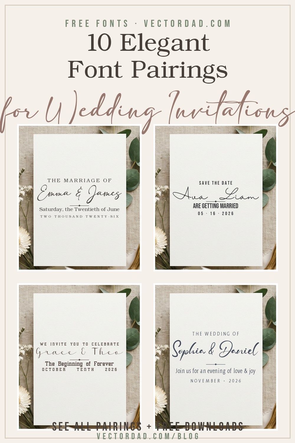
5 Font Pairings for Wedding Invitations
1. Adelia + Angleterre Book

Why it works: Adelia is a flowing, modern calligraphy script with graceful, generous loops – the kind of hand that makes two names feel like a vow. Angleterre Book is a refined classical serif that brings a sense of formality to the date and welcome lines, so the romance up top is balanced by a grounded, highly readable foundation underneath.
Use it for: classic and timeless weddings, formal evening receptions, and any invitation suite that wants understated luxury.
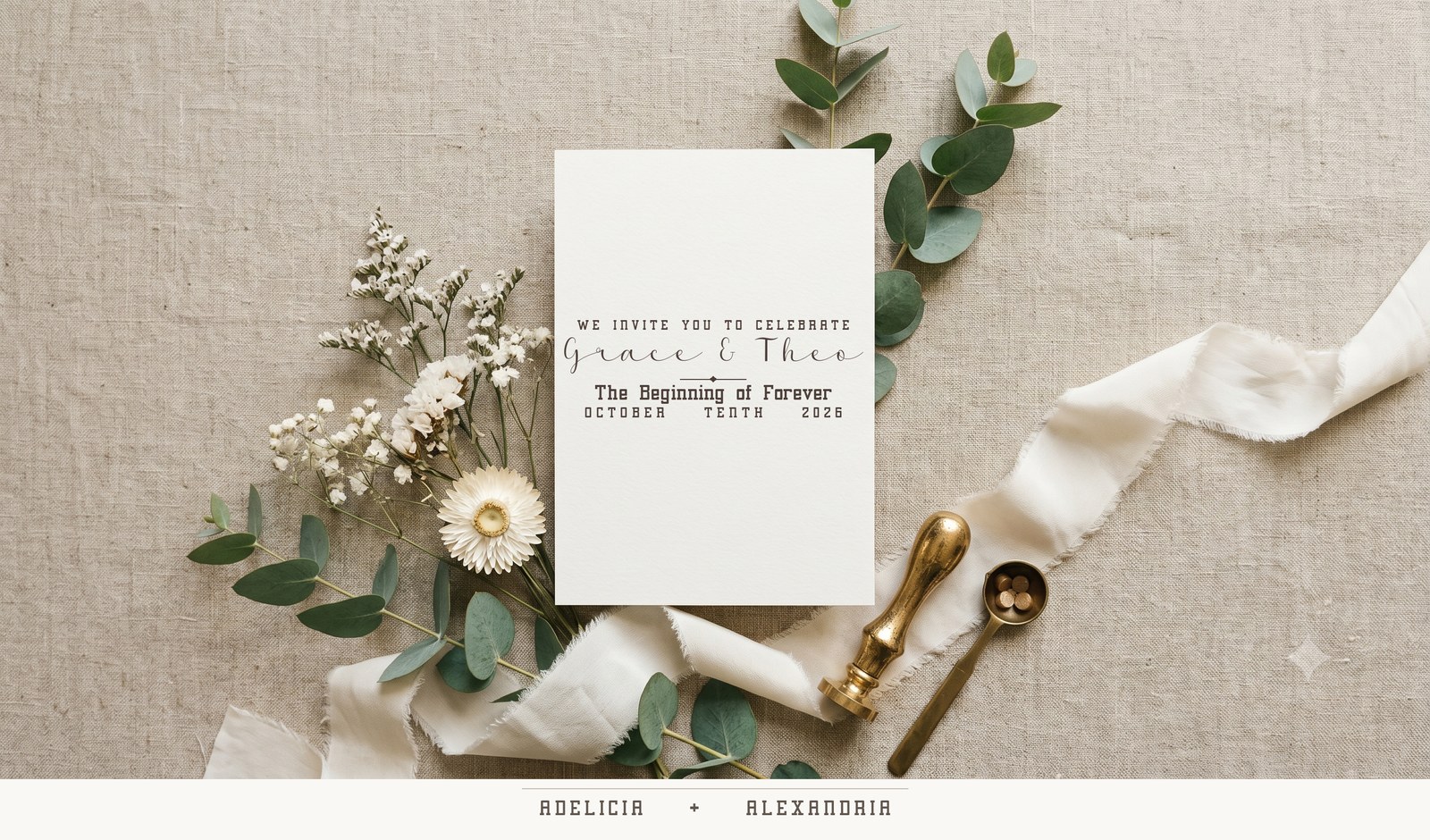
2. Amalina + Adolphus Serif

Why it works: Amalina is a soft, romantic calligraphy script with delicate connecting strokes that feel genuinely handwritten. Adolphus Serif is a clean, contemporary serif with open letterforms, so it keeps the practical details crisp without ever fighting the script’s personality. The result reads modern and heartfelt at the same time.
Use it for: garden and outdoor weddings, spring and summer celebrations, and soft, romantic colour palettes.
3. Adelicia + Alexandria
Why it works: Adelicia is a formal, decorative script with elegant capitals and confident flourishes – a true statement face for the names. Alexandria is a structured, high-contrast serif that holds its own as a bold supporting line, which keeps the whole card from feeling fragile. Together they read grand and editorial.
Use it for: black-tie and ballroom weddings, formal save-the-dates, and dramatic monochrome stationery.
4. Halimun + Bebas Neue

Why it works: The most modern pairing here. Halimun is a relaxed signature script that looks like a real handwritten autograph, and Bebas Neue is a tall, narrow, all-caps sans that feels clean and gallery-minimal. Loose script over condensed caps is the look you see on contemporary save-the-dates everywhere, and it costs you nothing.
Use it for: minimalist and modern weddings, city-hall and elopement announcements, and trendy save-the-date cards.
5. Adam Samuel + Aida Serif

Why it works: Adam Samuel is a fine, tapered script with a delicate, fine-art feel, while Aida Serif is a slim condensed serif that stacks beautifully into letter-spaced, small-caps detail lines. The pairing has an understated, editorial elegance – perfect when you want refined rather than flashy.
Use it for: fine-art and editorial wedding suites, intimate ceremonies, and neutral, paper-forward designs.
5 More Wedding Font Pairings to Try
Once you understand the script-plus-serif formula, the same ten fonts remix into plenty more invitation-ready combinations:
- Adelia + Adolphus Serif – flowing calligraphy over a clean modern serif for relaxed-formal suites.
- Amalina + Angleterre Book – a romantic script with a classic roman serif for timeless garden weddings.
- Adelicia + Aida Serif – a decorative statement script over slim, tracked caps for editorial drama.
- Halimun + Alexandria – a casual signature paired with a bold serif for modern-meets-classic save-the-dates.
- Adam Samuel + Bebas Neue – a fine script over tall minimalist caps for understated, contemporary cards.
Make It in Seconds With VectorDad’s Free Font Tools
You do not need expensive design software to use any of these pairings. Drop the couple’s names and details into the Vector Quotes Maker to lay out a two-line invitation in seconds, or build a wedding monogram for the envelope flap and welcome sign with the Monogram Maker – try the 2-letter and 3-letter versions for joined initials. For curved “save the date” banners and arched names, reach for the Curved Text Generator and Arch Text Generator. When you are ready to choose more typefaces, browse the full free font library – especially the calligraphy, script, and serif collections, plus the commercial-use collection if you plan to sell your designs. And if you also make apparel, our companion guide to font pairings for t-shirts applies the same bold-plus-quiet formula to shirt designs. And if you are branding a business, our guide to font pairings for logos and branding brings the same approach to wordmarks and taglines. Styling your home after the big day? Our guide to farmhouse font pairings applies the same elegant approach to rustic signs and decor. Planning something spooky? Our guide to spooky Halloween font pairings brings the same idea to signs, posters and party printables. And when the holidays roll around, dress your designs in our festive Christmas font pairings. Teaching or planning your year? Our guide to classroom & planner font pairings brings the same friendly-plus-clean approach to welcome posters, name tags and planner covers. Personalising a gift? Our guide to monogram font pairings applies the same character-plus-calm formula to decorative initials and names.
Putting your lettering on a wall? Our companion guide to bold font pairings for posters and flyers applies the same character-plus-calm formula to event posters, sale flyers and signage.
Wedding Invitation Font Pairing FAQ
What fonts are best for wedding invitations?
The best invitation fonts pair one expressive script or calligraphy face for the couple’s names with one clean serif or sans for the details. The script supplies the romance while the supporting font keeps dates, times, and addresses easy to read – the two jobs every invitation has to do.
How many fonts should a wedding invitation use?
Two is the sweet spot: one font for the names and one for everything else. You can occasionally add a small third accent like a monogram, but more than two competing typefaces usually makes a formal invitation look cluttered.
Are these wedding fonts free for commercial use?
It varies by font, so always check the license on each product page before you sell printed suites. On this list, Angleterre Book, Amalina, Adolphus Serif, Adelicia, Alexandria, Adam Samuel, Aida Serif, and Bebas Neue (public domain) are cleared for commercial work, while Adelia and Halimun are listed for personal use. When in doubt, confirm on the font’s download page.
What size and format should invitation fonts be?
Design at full size – most invitations print around 5 × 7 inches – and export your lettering as a vector SVG or a high-resolution PNG so the edges stay crisp in print. Vector formats are also ideal if you are cutting names or monograms on a Cricut or Silhouette.
Can I pair a script with another script?
It is risky. Two scripts usually fight for attention and hurt readability. If you love the look, pair one bold, formal script for the names with a much simpler, lighter script only for a tiny accent – and let a clean serif carry the actual details.
Try one of these five pairings on your next suite, then remix the same ten fonts into combinations of your own. With the right two typefaces – and the rendered mockups above to guide you – even a simple ivory card can look like an invitation worth keeping.
Pingback: 10 Font Pairings for T-Shirts That Sell (Free Cricut Fonts)
Pingback: 10 Font Pairings for Logos & Branding (Free Fonts)
Pingback: 10 Farmhouse Font Pairings for Signs & Decor (Free Fonts)
Pingback: 10 Festive Christmas Font Pairings (Free Fonts for Cricut) - Vectordad Blog
Pingback: 10 Spooky Halloween Font Pairings (Free Cricut Fonts)
Pingback: 10 Classroom & Planner Font Pairings (Free Teacher Fonts)
Pingback: 10 Monogram Font Pairings for Personalized Gifts (Free Fonts)
Pingback: 10 Bold Font Pairings for Posters & Flyers (Free Fonts)