A logo lives or dies on its lettering. Most memorable brandmarks are nothing more than a name set in exactly the right type, so when you are working with one or two words, the fonts have to carry the entire personality of the business. Pick a pairing that feels confident and cohesive and even a plain company name starts to look like it belongs on a storefront, a business card, and the side of a coffee cup.
This post is part of our complete font pairing guide – a hub of the best free font combinations for every project.
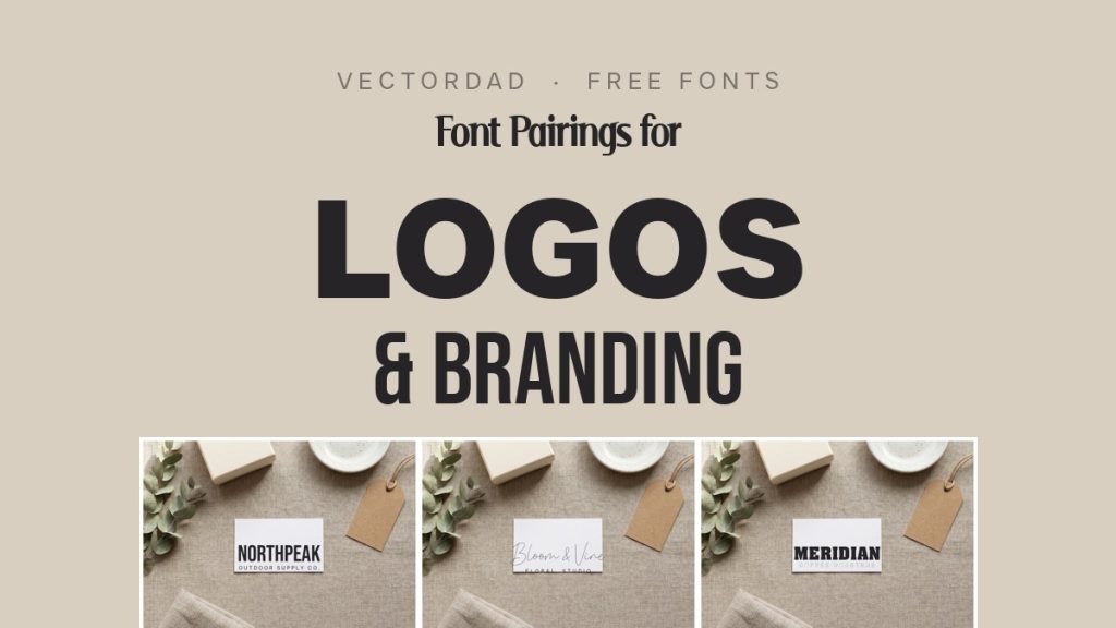
Font pairing for branding is simply the craft of combining two complementary typefaces so each one does a job the other cannot: one distinctive font to carry the brand name, and one clean, quiet font for the tagline or supporting line. Get that contrast right and the whole identity reads as intentional. Below are five logo pairings – every one built from free fonts you can download here on VectorDad – rendered onto real branding mockups so you can see exactly how each looks on a card before you download a thing.
How to Pair Fonts for a Logo: 4 Quick Principles
Before the examples, here are the rules that make a two-font logo work. Keep these in mind and you can build brand identities far beyond this list.
- Contrast is everything. Pair one characterful brandmark font with a calmer, simpler partner. Two loud fonts compete with each other; a bold mark over a quiet tagline feels deliberate.
- Keep it simple. A logo has to work small. Stick to two fonts, skip the heavy effects, and let clean spacing do the work – clutter is what makes an identity look amateur.
- Design for scalability. Your mark needs to stay legible on a wide website header and a tiny social avatar alike. Test the tagline at small sizes and add a little letter-spacing so it never turns to mush.
- Match the brand personality. Let the brandmark set the tone – geometric for modern, slab for sturdy, script for boutique – then choose a neutral companion that stays out of its way.
5 Font Pairings for Logos & Branding
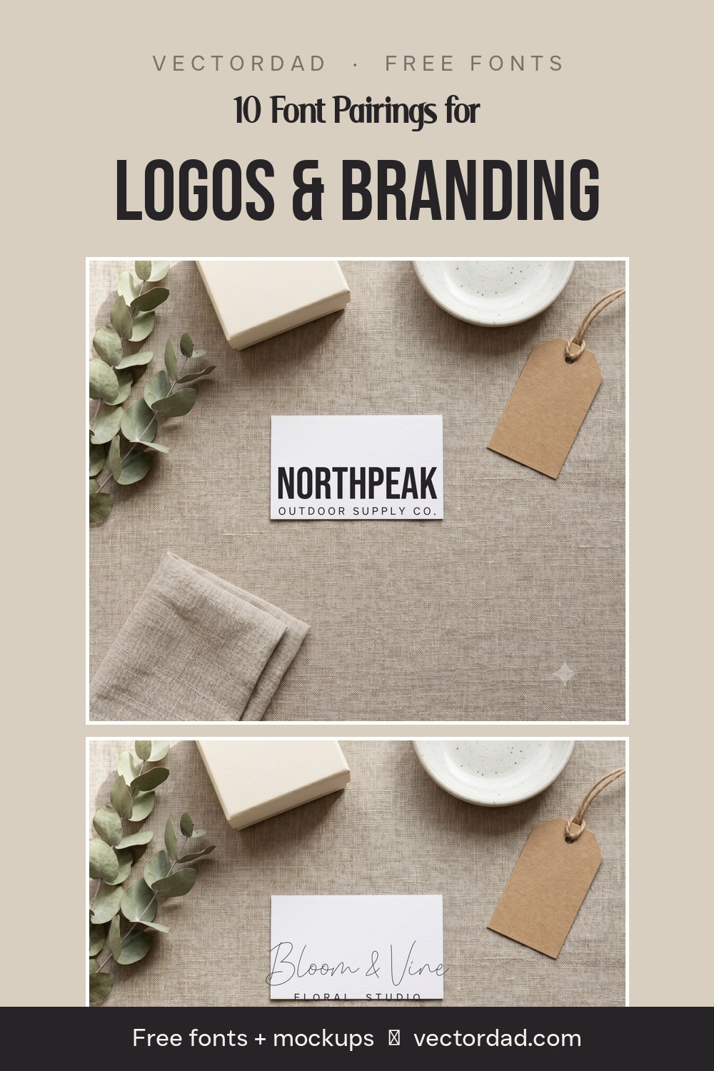
1. Bebas Neue + Just Sans
Why it works: Bebas Neue is a tall, narrow, all-caps sans that reads clean and premium – perfect for a confident wordmark. Just Sans is a friendly geometric sans that sits quietly underneath as a spaced-out tagline, so the name gets all the attention while the supporting line stays effortlessly readable.
Use it for: outdoor and lifestyle brands, apparel labels, gyms and studios, and any modern startup that wants a tall, structured wordmark.
2. Aachen + Helvetica
Why it works: Aachen is a chunky, rounded slab serif that feels sturdy, established and friendly – the kind of mark you instantly trust. Helvetica is about as neutral as a sans gets, so as a tagline it adds zero noise and lets Aachen lead. A characterful slab over a neutral sans is a classic identity formula.
Use it for: coffee roasters, bakeries, hardware and heritage brands, and anything that wants to feel warm but dependable.
3. Southern Script + Just Sans
Why it works: Southern Script is a flowing signature script with real handmade charm – gorgeous for a brand name, but impossible to read in a block. Pairing it with clean, widely spaced Just Sans caps grounds the script and turns a pretty signature into a balanced, boutique-ready lockup.
Use it for: florists, beauty and wellness brands, boutiques, and any business that wants an elegant, personal feel.
4. Advertising Gothic + Helvetica
Why it works: Advertising Gothic is a vintage, inline display face that drips with retro character – think old packaging and hand-painted signage. Because it is so loud, it needs the calmest possible partner, and Helvetica delivers, keeping the founding year and category line crisp and legible beneath the throwback mark.
Use it for: breweries, barbershops, diners, record shops, and any brand leaning into a nostalgic, established-era look.
5. Just Sans + Serif
Why it works: The most contemporary combo here. Just Sans in its extra-bold weight makes a clean, geometric wordmark, while a refined Serif tagline adds a touch of editorial polish underneath. Geometric sans over a quiet serif is the pairing you see on modern studios and design-forward brands everywhere.
Use it for: interior and architecture studios, agencies, consultancies, and premium product brands.
5 More Logo Font Pairings to Try
Once you understand the bold-plus-quiet formula, the same seven fonts remix into plenty more brand-ready lockups:
- Aachen + Just Sans – a sturdy slab wordmark over a clean geometric tagline for friendly product brands.
- Bebas Neue + Helvetica – tall condensed caps over neutral sans for the most minimal modern mark.
- Southern Script + Serif – a script name with a serif tagline for upscale, editorial boutiques.
- Just Sans + Helvetica – two clean sans at very different weights for a quiet, corporate identity.
- Advertising Gothic + Just Sans – retro display anchored by a modern sans for vintage-meets-now branding.
Build Your Logo in Seconds With VectorDad’s Free Tools
You do not need expensive design software to try any of these pairings. Drop your brand name into the Vector Quotes Maker to lay out a two-line lockup, spin up initials with the Monogram Maker, or reach for a themed generator that matches the vibe: the Retro Font Generator for throwback marks, the Gothic Font Generator for bold heritage logos, or the Varsity and College Font Generators for team and club branding. When you are ready to choose more typefaces, browse the full free font library, or dive into the sans-serif, serif and script collections – and always check the commercial-use collection if you are branding for clients.
Designing across other formats too? Our companion guides to font pairings for t-shirts and font pairings for wedding invitations, plus our classroom & planner font pairings guide, apply the same bold-plus-quiet formula to apparel and paper goods. Decorating a home too? Our guide to farmhouse font pairings for signs and decor applies the same bold-plus-quiet formula to rustic wood signs. Planning something spooky? Our guide to spooky Halloween font pairings brings the same idea to signs, posters and party printables. And when the holidays roll around, dress your designs in our festive Christmas font pairings. Personalising a gift? Our guide to monogram font pairings applies the same character-plus-calm formula to decorative initials and names.
Putting your lettering on a wall? Our companion guide to bold font pairings for posters and flyers applies the same character-plus-calm formula to event posters, sale flyers and signage.
Logo Font Pairing FAQ
What font pairing works best for a logo?
The safest formula is one distinctive brandmark font plus one clean, neutral font for the tagline. The contrast makes the name memorable while keeping the supporting line readable at any size – the two things a logo has to do.
How many fonts should a logo use?
Two is the sweet spot: one font for the brand name and one for the tagline or supporting text. A third typeface almost always makes a mark feel busy and harder to scale down cleanly.
Are these fonts free for commercial use?
It varies by font, so always check the license on each product page before you use a mark commercially. On this list, Aachen and Bebas Neue are cleared for commercial work, while Just Sans, Helvetica, Southern Script, Advertising Gothic and Serif are listed for personal use or as demos – confirm on the font’s download page before selling.
What size and format should a logo be?
Design your logo as a vector (SVG) so it stays razor-sharp at every size, from a website header to a stamped business card. Export a high-resolution PNG with a transparent background for everyday digital use, and always test the tagline at small sizes.
Can I pair more than two fonts in a brand identity?
You can across a full brand system – a display font for headlines, a body font, and the logo lockup – but the logo mark itself should stick to two. Give each font a clearly different job and weight so they never compete.
Try one of these five pairings on your next brand, then remix the same fonts into your own lockups. With the right two typefaces – and the mockups above to guide you – even a one-word company name can look like an identity worth remembering.
Pingback: 10 Font Pairings for T-Shirts That Sell (Free Cricut Fonts)
Pingback: 10 Elegant Font Pairings for Wedding Invitations (Free Fonts)
Pingback: 10 Farmhouse Font Pairings for Signs & Decor (Free Fonts)
Pingback: 10 Festive Christmas Font Pairings (Free Fonts for Cricut) - Vectordad Blog
Pingback: 10 Spooky Halloween Font Pairings (Free Cricut Fonts)
Pingback: 10 Classroom & Planner Font Pairings (Free Teacher Fonts)
Pingback: Font Pairings That Actually Work: 50+ Free Font Combinations - Vectordad Blog
Pingback: 10 Monogram Font Pairings for Personalized Gifts (Free Fonts)